Last Updated on October 23, 2024
Using images on your website is a great way to get across information and provides a great visual aesthetic to the end-user. Building an image gallery with the use of CSS makes that connection even easier to achieve.
In this brief guide, you will learn how to build your own image gallery in HTML and how to style it using CSS.
Building a responsive image gallery will also be covered to help you keep your designs right with screen variables. If you need any refreshers on the basics of either, please refer to the HTML for Dummies or CSS Basics for a quick catch-up.
Why Use an Image Gallery?
You can set up an image on an HTML page with ease. In the HTML code example below, the image element tag has been used to display a personal doodle image.
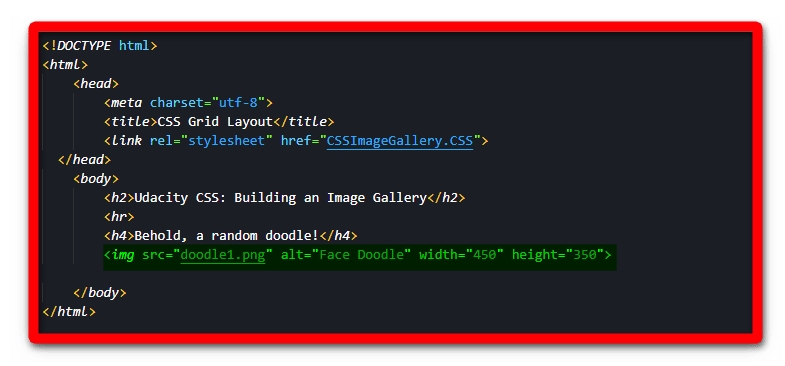
With the image tag in place, you can see the following result on the HTML page.
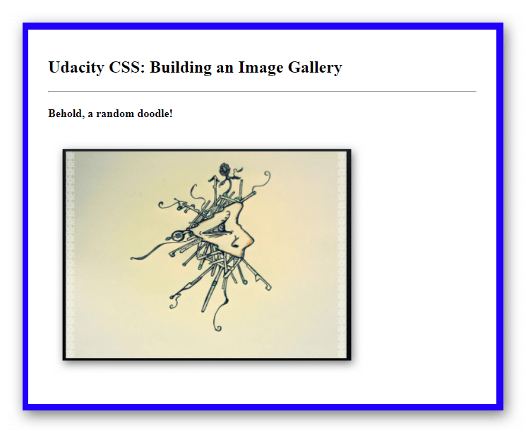
The image is now loaded and ready for viewing on the page. This display option is great if you only have one image to use on the page. However, consider if you were trying to display a portfolio of images of an artist or a product. You could definitely add in all the other images just using the image tag over and over.
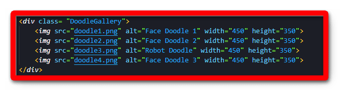
In the image below, three more image tags were added to the HTML document. In the next section, you will see the basics of how to create the gallery container as well as some interesting methods you can use to style the gallery itself.
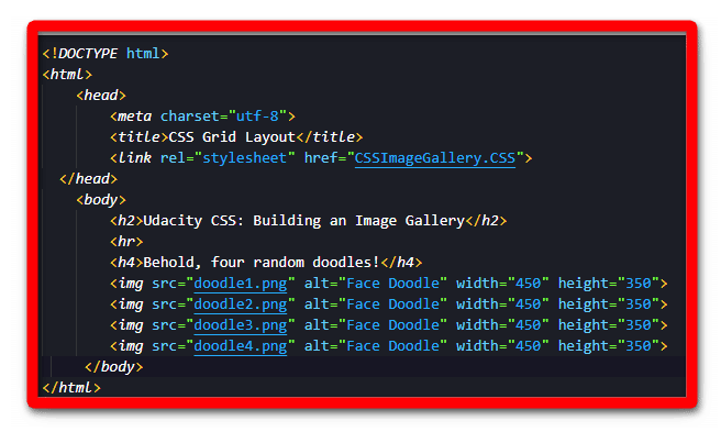
The results on the page are shown below.

The images loaded just as the first one did. So you might wonder why you might need to invest more time into building an image gallery when it was done with the image tag.
The answer sits with the power of CSS. Creating a container for the images is an easy way to build an image gallery that also lets you apply wonderful styling options.
How to Create an HTML Image Gallery
Setting up the gallery itself is pretty easy. To begin with, you can create a div container to hold your gallery images. In the sample code below, you can see a div is added with a class name attached. These classes help with CSS styling later on.
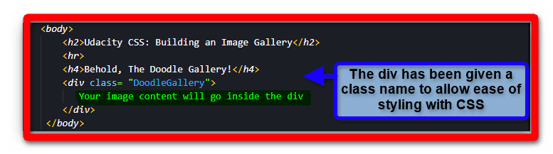
In the next example, the images are nested within the div container.
With the gallery created, CSS styling can be added. In the image below, you can see how its class name styles the div container. In addition, a few effects have been added, such as a border, padding, margin, and a gradient background. In contrast, the HTML background was also given a gradient background.
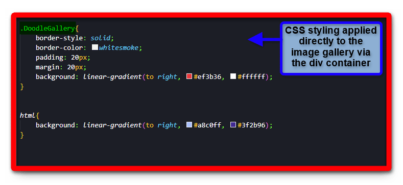
With the above CSS code in place, the HTML page will render the following.

Right away, you can see how the gallery has more of a presence on the page. Adding titles or descriptions for each image can enhance this. You can do this with a simple paragraph element. However, in the following example, two more divs will be used to help with the effect.
The first new div will be a container for each image in the gallery. Each image will receive one of these. Next, the second div will be added to hold the image title. These divs will be inside the image containers. In the HTML code example below, you can see the two divs in action.
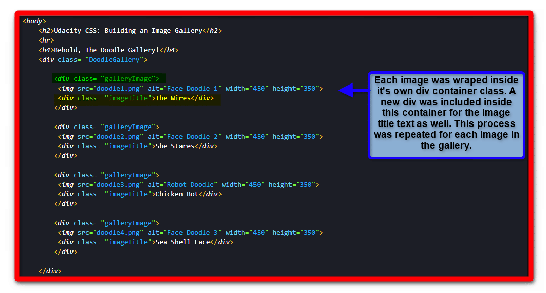
The reason for giving each image its container was again for ease of access when using CSS for styling. The use of a div for the image title is the same. Yet, it was nested within the image container to keep them together.
In the next example, you can see the CSS styling that has been applied to the image gallery. There are quite a few changes to the design on display. These were changed purely to show how an image gallery could be styled easily. Take note that the image gallery also had its display option set to a grid. If you want to know more about using grids in your HTML design, check out How to Build Your Own CSS Grid Container.
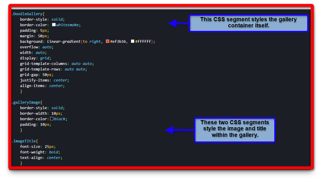
With the additional CSS styling in effect, you receive the following result on the HTML page.
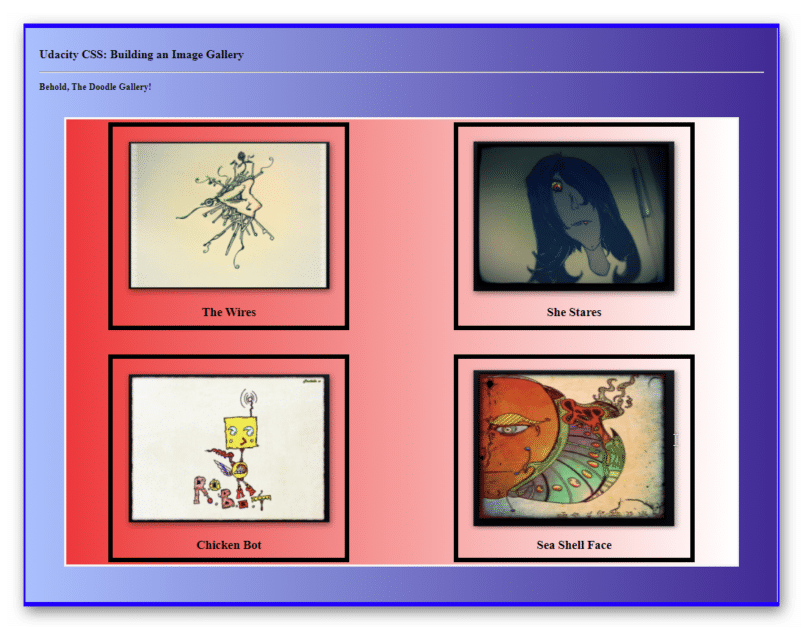
The image gallery is now more of a display piece for the page as it pops much easier for the end-user. In the example, it’s in the form of an art display, although you can see how it would be great for other options like a travel site, restaurant, or storefront.
Creating a Responsive Image Gallery
It’s not an uncommon issue to see a website have issues with sizing on media elements like pictures. Commonly, the errors manifest as HTML content overlaps, elements disappearing, or non-usable content.
To plan for these issues, you have the option to make the content on your page responsive. The term responsive means that the HTML page can be resized for various screens and still operate as needed. There are a few ways to include responsive design depending on what you know.
In the following example, the display value of flexbox will be applied to the image gallery container. Flexbox replaces the value of grid that was used in the example above. Take a look at the code example below to see the changes.
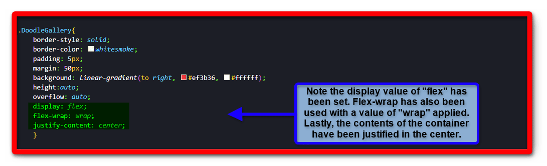
With the flexbox display active, changes to the window size are now more responsive with the content in mind. Specifically, the div container housing the gallery images on the page. In the next few screenshots notice how the gallery scales to meet the change in screen size.
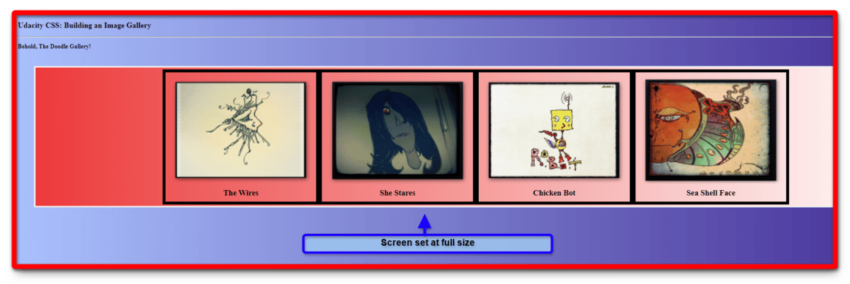
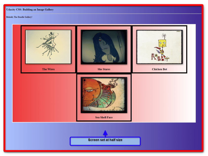
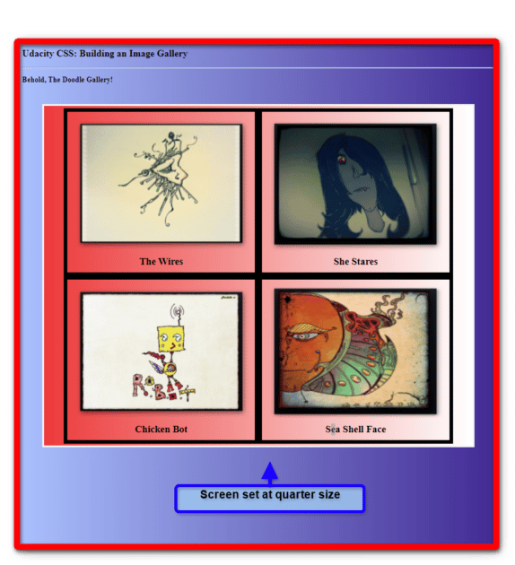
No matter what size the screen is set to, the image gallery still tries to fit itself in properly. You should test your own content to see where it might fail you in the process. There are times that some elements can overlap depending on the styles you applied.
On pages with complex HTML content and Javascript running, you may find an element simply fails to work properly within the context of others. It’s always a great idea to double-check your work once you make a change to see if any behaviors have changed.
Taking it Up Another Level
Using CSS and HTML for an image gallery can yield awesome results. However, adding in a few more tools can really make a difference between awesome and completely amazing. One very powerful way to do this is by learning How to Add Javascript to HTML.
Why stop at just the basics? The creative ability in programming is allowing people to do even more with their ideas. If you want to advance your career, take the first steps by learning to code. Having these skills can help you open doors to those new professional possibilities. Enroll in Udacity’s Intro to Programming Nanodegree today to start the journey.


