Last Updated on October 23, 2024
There are several attributes to excellent web design. However, designers will agree that content positioning is one of the most important aspects of their craft. Knowing just how and where your HTML content will fit on a page allows you to understand how the general design will behave.
Using the CSS display property allows you to control how the content placement will function. In this short guide, you will learn how to create and use the CSS display property of grid and inline-grid to help position your content. Sample code and images are provided to help guide you along the way.
The CSS Grid Values
Before you try to build a grid container, you will need to understand the difference between the two CSS values. To create a CSS grid container, you will have to call upon the CSS display property.
You will work with grid and inline-grid CSS display properties. Both of these values tell the browser that you want to take the target HTML content and display it with a grid function instead of the normal block-level styling. This can also take in the child elements to have them function as a grid.
CSS Display: Grid
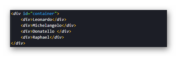
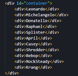
The first display option for building a grid container is aptly called a grid. A selection of sample code has been provided for you below to help provide a visual aid. You may also notice the use of an id for the div set as “container” in the code. If you are not familiar with the concept, please take a look at the blog HTML/CSS Class and ID Selectors for everything you need to know before moving on.
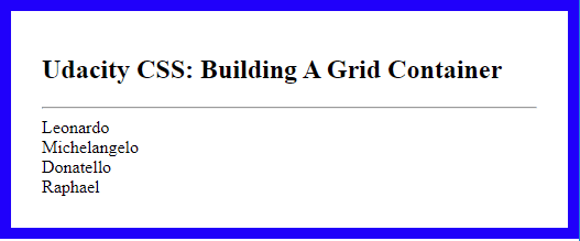
With no CSS styling added, the code will render on the page as shown below.
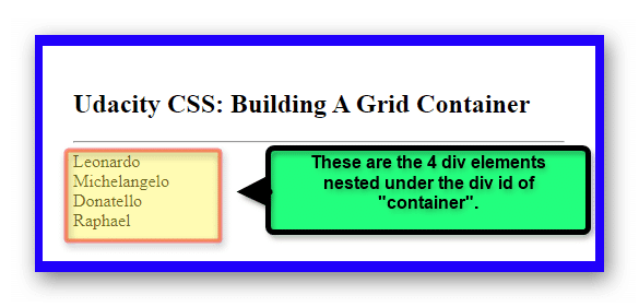
The image below details the nested divs in the container.
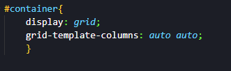
Setting the CSS display property value to “grid” is an easy matter. However, take a look at what happens when you do.
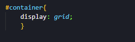
The result seems to be no different.
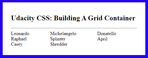
Building Grid Container Columns
You might notice that nothing has changed for the position or appearance of the HTML content. The reason for this is that the grid display value needs to be told how to show the content. The grid display is only using one column by default.
To alter this, you can use the property of “grid-template-column” to define how many columns you want and how wide they should be. In the example below, you can see the grid-template-columns property used.
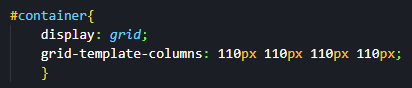
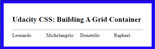
This will provide the following output on the page.
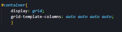
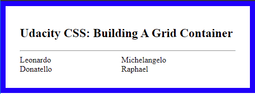
You also have the option to simply set the column widths to automatically set themselves as well.
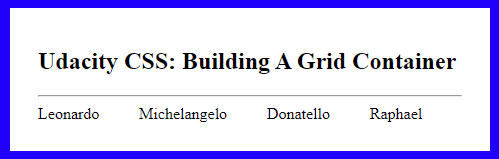
Setting the column widths provides the following page result.
Note what would happen if you were to remove two of the column values from the property as shown in the sample code below.
The result on the page would appear as follows:
You can see that the content was automatically arranged according to the new column amount setup. Although, you might wonder what it would look like with more rows.
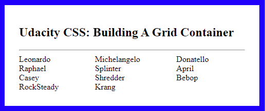
Building Grid Container Row
With the columns in place, you can move on to the idea of adding rows to the grid container. In the sample code below, a few more divs were added to the grid container.
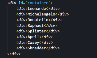
This provides eight divs within the container to work with. If you wanted four rows of content to contain them, you would need to use the “grid-template-rows” property. The values for this property are similar to using the columns. You can add the rows’ heights with spaces in between them. They can be specified or set automatically as well.
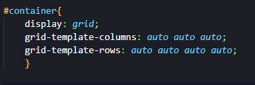
This will give you the following page output.
You might notice that the code specified four rows in the grid container. However, in the example above there are only three showing. The grid display here is working to automatically place the content as it fits on the page in accordance with the provided height and width of the columns and rows. As the provided value was “auto,” the content is arranged with that in mind.
Watch what happens when three more divs are added to the grid container.
This now provides the following output.
The fourth row is now visible as the content has automatically been arranged in the grid container.
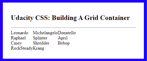
Justifying and Aligning Grid Container Content
Having the content within the grid container is one thing, but now you need to know how to tweak how that content is positioned within. To that end, you can use the “justify-content” and “align-content” properties.
The Justify-content Property
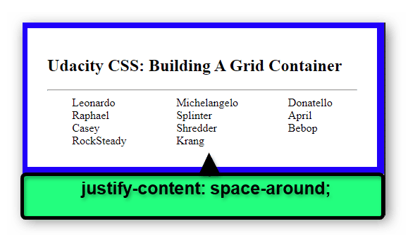
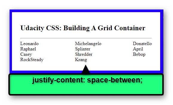
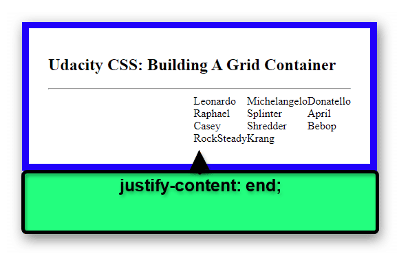
The justify-content property allows you to decide how the grid container itself is justified. This can help when trying to keep items symmetrical for design. The justify-content property can also take the following values.
- space-evenly: Elements spacing is set up so that it is evenly distributed at the end and start of the line.
- space-around: Elements are provided an even spacing on the grid line.
- space-between: Elements are provided an even spacing between each other.
- center: Elements are set to be centered on the grid line.
- start: Elements are set at the start of the grid line.
- end: Elements are started towards the end of the grid line.
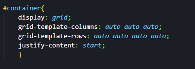
To use the justify-content property, you set the property and provide your desired value. In the example below, it has been set to the value of start.
This will provide you with the following page render.
Take a look at how other justification options alter the grid content.
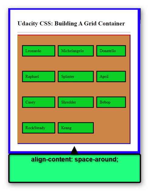
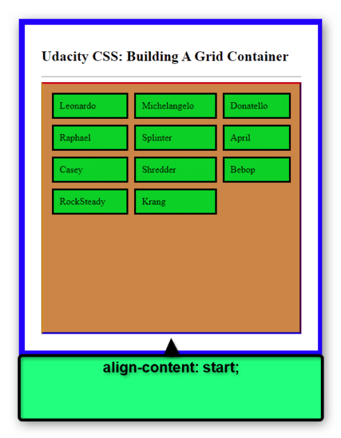
The Align-content Property
The align-content property allows you to set the vertical alignment of the grid within the container. It’s important to note that if the grid is a single line or is simply the same height as the container, this property will not be able to take effect. Essentially, it would not have any room left to enact the changes.
This property shares the same values as the justify-content property.
- space-evenly
- space-around
- space-between
- center
- start
- end
In the CSS example below, the align-content property has been set to center.
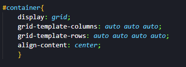
This provides the following output on the page.
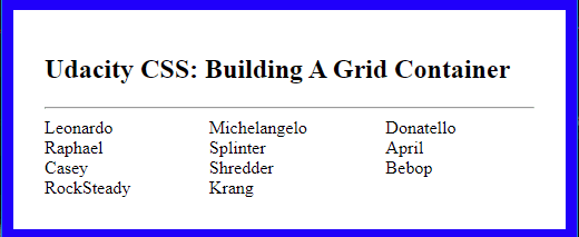
You might notice that once again, there is no change with the code applied. Added styling is applied in the next CSS code example to help provide a visual aid.
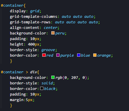
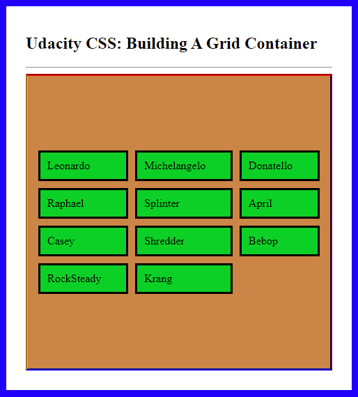
The container has had a height added to it to help define it. This also allows the align-content value to be easier to see in action as well. With the current sample code in effect, the page will render as shown below.
To see how the vertical alignment takes effect take a look at the next two examples.
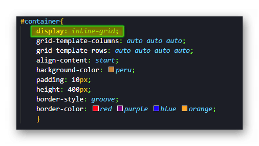
Grid Container: Inline-Grid Value
The final note of this guide is the value of inline-grid. When you use the display value of the grid, the container acts as a block-level element. However, with the display value of inline-grid, the container instead acts as an inline element.
In the sample code below, the inline-grid value is used.
With the above code in place, it creates the following render on the page.
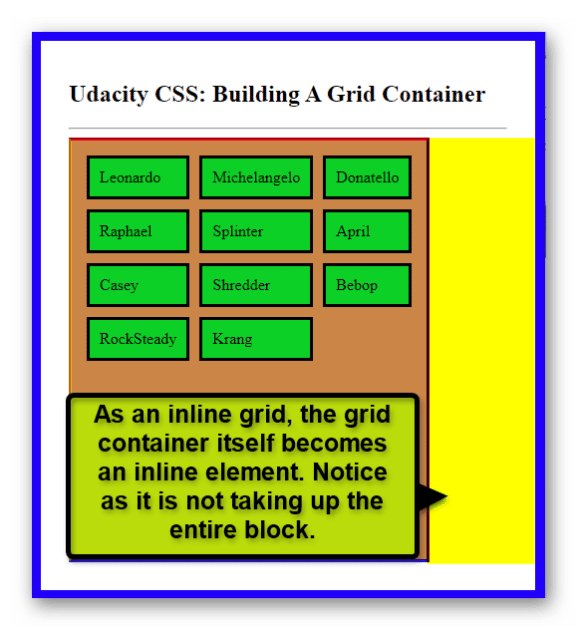
Using the inline-grid value can be helpful if you want to add context to a container by floating it next to it or even simply add another container next to it. The need for inline or block-level containers is dependent on the design and style of the page. The option for it is just another great way that CSS provides tools for the job.
__________________________________________
Why Not Go Even Higher?
Why stop at just CSS? The creative ability in programming is allowing people to do even more with their ideas. If you want to advance your career, take the first steps by learning to code. Having these skills can help you open doors to those new professional possibilities. Enroll in Udacity’s Intro to Programming Nanodegree today to start the journey.


