Images are a major draw for a webpage. Knowing how to properly manipulate their size per the end-users viewpoint can dramatically improve their impact. In this short guide, you will learn how to apply responsive design to your web images through CSS. Essentially, you will tackle how to resize images automatically with CSS.
This guide is one of many crafted with CSS beginners in mind. If you need help on other subjects, check out the HTML or CSS content hubs for a plethora of helpful guides. If you are looking for a good starting point, the foundation guides HTML for Dummies and CSS Basics for Beginners are a great place to begin. However, if you’re ready for responsive image scaling through CSS, dive into the content below.
What does Responsive Image Design Mean?
In a previous post, the topic of Responsive Web Design and HTML Frameworks was covered. This detailed how important it is to set up your site design to work with the various possible devices an end-user may have.
The concept of the meta tag “viewport” was also introduced to help the browser in setting a properly sized viewing area for your HTML content. This helped the content of the webpage to scale in consideration of changes made to the viewing area.
Using that same mindset, the idea for responsive web design with images is to be able to scale them per changes to the view. In this way, even when a window is resized or a different device is used, the applied image will not become unusable.
Width and Automatic Height Scaling
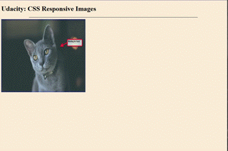
One method to add automatic scaling to your web image is to work with the width and height properties in CSS. In the HTML example below, you can see that an image has been added with the “img” tag. You may also notice it has a set width and height value of 400 and 350 respectively.

Left as is, the image does not alter its size concerning changes made to the window. This will provide an experience as displayed in the GIF below.
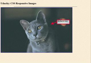
In that example, the image did not change at all when the window was expanded or contracted. In the next example, CSS has been used to affect the image element tag. The width has been set to 100 percent while the height has been set to auto. This combination will provide a responsive effect on the image as the user alters the window size.

In the example provided below, you can see this in effect.
Width vs Max-width
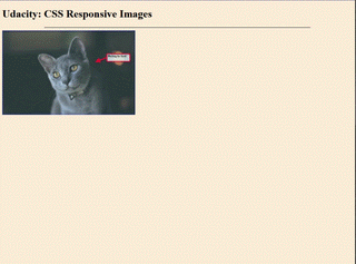
In place of using the width property, you also have the option to instead apply the “max-width” property. The inherent key difference between the two is that the latter provides a limit to the image size. When you use the width property, you can actually have the image scale past its intended size. This oversizing can make some images appear blurry or distorted.
Using the max-width property instead allows you to control that effect as it will simply not go over its provided width. In the CSS example below, the max-width has been set to 60 percent. This will allow the image to remain at that size while still scaling back as needed. However, it will not overstretch the image past that limit.

You can see this in effect with the example below.
Responsive Background Images
Setting a background image is a wonderful way to decorate a page as well as provide a canvas for your CSS styling to work upon. However, you should also take care to have the background work alongside the responsive image concepts for the end-user.
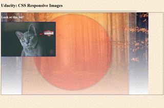
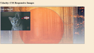
In this next example, you can see a div has been set up for use. Inside the div, you still have the cat image with an added heading number two element added above it.

In the next image, you see the CSS properties applied to the div element. Note that the property value of “background-size” is set as “contain” in the image. This value provides you with the ability to scale the background image in relation to the content area, (the div in this case).

The value of background-repeat is also set to “no-repeat” in this example, however, that is not necessary for this to work. That option is a styled choice alone. With these values in place, the result appears as shown in the example below.
The background-size value can also be set to full width and height by using the values of “100% 100%” instead of “contain”. Take note that there is no comma or colon between the values, only a simple space.

This ensures that the background image will cover the entire content area you applied it to.

Lastly, you also have the option of setting the background-size value to “cover” instead. A notable difference in this method is that this will still take the provided aspect ratio into account. This means that when you have a user change the window, part of the background may be hidden from view. See the example below for this effect in action.
Take Web Design Even Farther
The ability to create responsive elements on a page is impressive. This short guide only covers some of the more basic approaches for a beginner. Consider what you could do with an injection of code through languages such as Javascript, React, or even Python.
Each one of these can bring something powerful to the table in terms of your web design ability. The only thing stopping you from taking hold of these tools is a choice. Empower yourself with the choice to learn and succeed. Enroll in Udacity’s Intro to Programming Nanodegree today to start the journey towards greater options.


