“Humans are visual creatures.” Ever heard that phrase before? It means that in order to process information, we — and all primates for that matter — look for “visual cues” in our environments.
In the digital age, the same behavior still applies. While computers are great at processing massive sheets of symbols and numbers, humans struggle to make sense of data in that format. That’s where data visualization comes in.
What’s Data Visualization?
Data visualization, which can be used in conjunction with machine learning, is a way to present information visually using charts, graphs and other visual formats. When data is visualized, it’s easier to spot patterns in datasets and define relationships between data points. In other words, data visualization helps with data interpretation.
Using data visualization for a presentation is a great way to clearly share complex information to an audience. These days, there’s lots of tools available to help you build the visualization you need. The following list of tips and tricks will help you create the best data visualization aids that you can.
Let the Data Visualization Speak for Itself
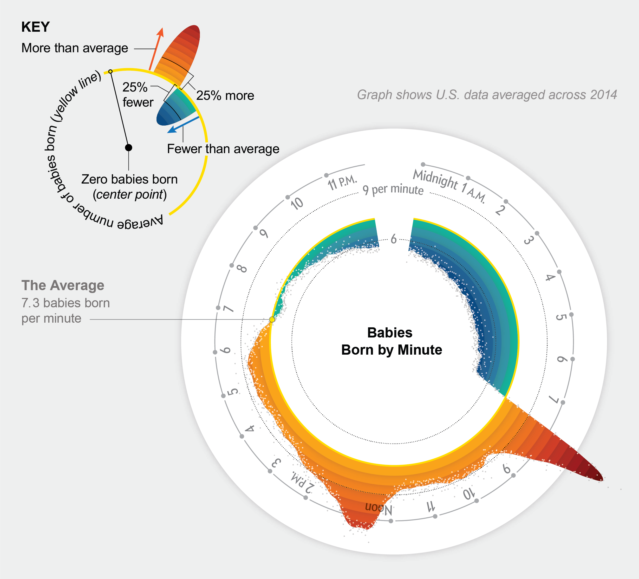
The whole point of using a visualization aid is to help the audience interpret data. When they look at the data visualization, the conclusion — whether that be patterns, relationships or whatever else — should be obvious fairly quickly, without the need to reason or sift through extra data.
Be Smart When Choosing a Format
Different data should be formatted differently. Furthermore, different conclusions from the same data might need different formats as well. It all depends on the story you’re trying to tell (with data). Trends over time are typically best displayed with a line chart. Quantities separated by category are best displayed in bar charts. There are also maps, matrices, box plots, etc. Get creative with it!
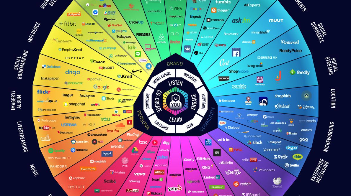
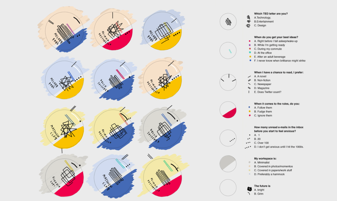
Use Colors and Fonts to Your Advantage
Data visualization goes beyond different charts and graphs. To make a data display truly communicative to an audience, it’s best to add style to help tell the story of your data. For example, think of a bar chart or pie chart. Sure, it’s possible to keep everything black, white or grey, but that doesn’t make the data pop. Instead, consider adding bold colors to help attract the eye to specific values.
Keep It Simple and Focused
While stylizing data visualizations is important, it’s also key not to overdo it. Tons of different fonts and colors, shapes and data points can get overwhelming. Remember, the goal is to let the data visualization speak for itself. The audience should be able to have clear takeaways from your data display.
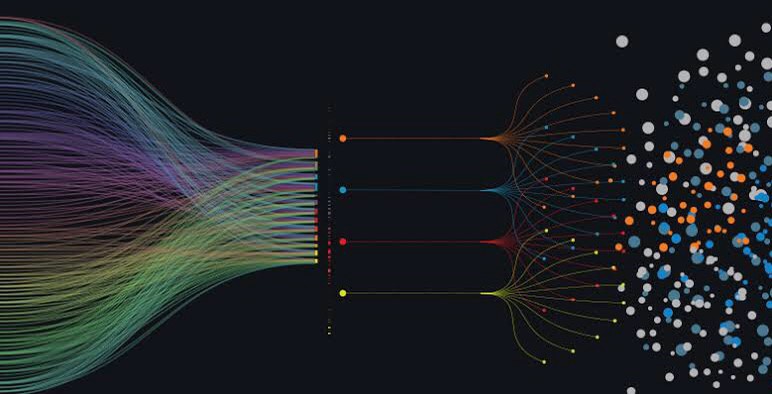
Break Complicated Visuals Into Layers
If you do find yourself in a spot where you have lots of complex data to show, try adding layers to your visuals. First, show a basic format of the data display to show a foundational layer. Then, use another layer on top that adds more complexity to the situation. Continue until you have covered all the data that you need to.
Your Career in Data Visualization
Does the idea of crafting well-thought-out data visualizations to interpret complex datasets sound exhilarating to you? You’re in luck because big data and business analytics jobs are growing quickly. Plus, careers in data visualization pay well, with most salaries falling in the $60,000 – $90,000 range.
Check out Udacity’s Data Visualization Nanodegree program to get started today.