Last Updated on October 23, 2024
Various aspects of data analysis are more valuable when displayed visually, such as through charts showing trends, correlations or changes in the data over time.
Visualizing the main learnings from a data set can help an analyst tell a story with the data and make their insights more accessible to a wider audience.
In this article, we show you how to create simple data visualizations in Python and provide a few recommendations on frameworks to use for creating charts and graphs.
Why Visualize Data?
Humans are not very good at visually understanding large amounts of data. Instead, most professional data analysts, government officials and business leaders seek to make sense of the numbers they use to generate clear, actionable insights.
If we look at, say, the population of a given country over time, we might see changes beyond the total numbers. Are there trends? Correlations with societal changes? How has the metric behaved in past decades?
Data visualizations help go beyond the numbers and dig into an underlying data set’s significance. Because human brains are much faster at interpreting visual information than numerical information, we use charts, graphs and tables to better communicate insights from data.
See for yourself: Which is easier to interpret — information presented in the form of a table…
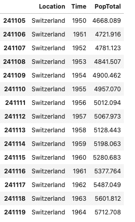
Table: Switzerland’s population between 1950 and 1964
…or the exact same information, laid out in the form of a chart?
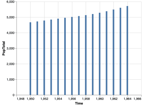
Chart: Switzerland’s population between 1950 and 1964
Most people will have an easier time grasping the information presented in the visual layout. For this reason, data analysts frequently need to create effective visualizations of their research and supporting data.
Next, let’s look at why Python is a great tool for the task at hand.
Why Python Is a Good Tool for Data Visualization
The Python programming language is one of the preferred tools in data science and data analytics, and there are definitely good reasons for its popularity. Python boasts a vast ecosystem of libraries, general accessibility for beginners and is quick to install and use. We elaborate on each of these advantages below.
Reason 1: Lots of Libraries
The Python ecosystem is well-developed and includes hundreds of libraries that facilitate all kinds of tasks, from reading CSV files to rendering 3D models.
Having ready-made libraries means that data analysts don’t need to reinvent the wheel every time they need to connect to a data source or parse a new file format. There’s probably already a library for these tasks on PyPI, the Python Package Index.
The Index also includes a number of well-maintained libraries for data visualization that we’ll cover in the next section.
Reason 2: Accessible to Beginners
Python code is easier to read and interpret for beginners compared to code in other languages like C++ or Java. Entry level analysts and programmers have an easier time with Python because of its less complicated syntax and higher level functions. Python’s legibility plays a major role in environments where folks reviewing the data analysis might not be Python experts.
Reason 3: Quick To Set Up and Use
With Python, the setup is quite straightforward — it takes only a few minutes to install the Python environment, provided that you have a fast network connection to download the binaries. Python runs on most, if not all, operating systems out there.
Seeing as Python is an interpreted language, an analyst using it gets fast feedback on the code they write through the use of the Python interpreter in interactive mode. When it’s time to visualize the data, charts and other graphical elements also show up without additional setup.
Basic Libraries for Data Analysis
Now that we know why data analysts love Python, let’s explore how Python’s libraries can facilitate data analysis and data visualization.
Before we even get to charts and graphs, we’ll first need to manipulate the data. For example, we might start by importing a CSV file and quickly checking how the data set is structured, before filtering out values and applying simple transformations. Pandas and NumPy are a great combo for such tasks.
Using Pandas for Data Set Visualization
Pandas is one of the most popular data manipulation libraries in Python. The library makes it easy to run simple operations, clean data and otherwise prepare a data set for visualization.
Notably, Pandas integrates well with data visualization libraries and allows them to be used directly on Pandas data frames, without the need to convert all the data into a visualization library-specific format.
In the following example of using Pandas, we’ll use the data set from the United Nations’ “World Population Prospects 2019.” We start by importing the data set and inspecting its contents:
| >>> import pandas as pd >>> country_df = pd.read_csv(“country_populations.csv”) >>> country_df.columns Index([‘LocID’, ‘Location’, ‘VarID’, ‘Variant’, ‘Time’, ‘MidPeriod’, ‘PopMale’, ‘PopFemale’, ‘PopTotal’, ‘PopDensity’], dtype=‘object’) >>> country_df[‘PopTotal’].head() 0 7752.117 1 7840.151 2 7935.996 3 8039.684 4 8151.316 Name: PopTotal, dtype: float64 |
Our data set contains more data than we can reasonably show on a graph at once, so let’s narrow down the data frame to the average population throughout a given year, only show the stats for year 2020 and only show stats per country (LocIDs above 900 are groups of countries or regions according to the UN’s rules):
| >>> pop_medium_df = country_df.query(‘Time==2020 & Variant==”Medium” & LocID < 900’).sort_values(by=[‘PopTotal’], ascending=False) >>> pop_medium_df[[‘Location’, ‘PopTotal’]] Location PopTotal 47894 China 1439323.774 115946 India 1380004.385 264291 United States of America 331002.647 116830 Indonesia 273523.621 192382 Pakistan 220892.331 … … … 166249 Montserrat 4.999 90137 Falkland Islands (Malvinas) 3.483 179682 Niue 1.618 246479 Tokelau 1.350 112410 Holy See 0.809 |
We now have a data set that’s ready to be used with a visualization library.
NumPy Is a Great Choice for Data Transformations
NumPy is another Python framework that forms the basis for any data analysis and visualization task.
Under the hood, Pandas actually uses NumPy for many of the computations. The integration works both ways, so it’s easy to use Pandas data frames with NumPy functions. In the following example we calculate an average for the Total Population across all countries:
| >>> type(pop_medium_df[‘PopTotal’]) pandas.core.series.Series >>> np.average(pop_medium_df[‘PopTotal’]) 33169.35629361702 |
Now, it’s time for some examples of data visualizations with Python.
Examples of Data Visualizations in Python
Python’s ecosystem includes multiple data visualization libraries. The most popular libraries provide similar functionality, so you normally would only use one of the libraries in your data visualization projects.
Below, we show examples of graphs created with Altair, matplotlib and plotnine.
Data Visualization Example With Altair
Altair is a Python data visualization library that provides a simple and expressive API. Let’s graph our population data set with Altair:
| import altair as alt alt.Chart(pop_medium_df[[‘Location’, ‘PopTotal’]][:10])\ .mark_bar().encode(y=alt.Y(‘Location’, sort=‘-x’), x=‘PopTotal’)\ .properties(width=800, height=600)\ .interactive() |
And here’s how the resulting chart looks in our Jupyter notebook:
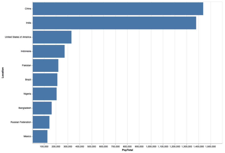
The Altair chart in our Jupyter environment.
Altair is generally a good choice for quickly creating interactive charts that look appealing, but the individual elements can be a bit harder to customize compared to the other libraries we cover.
Data Visualization Example With matplotlib
matplotlib is one of the most widely-used Python data visualization libraries. matplotlib’s API is more verbose than Altair’s, but it also provides a lot of control over the exact appearance of each element. Let’s check out the plot of populations of the last 10 countries in our populations list:
| import matplotlib.pyplot as plt data = pop_medium_df[‘PopTotal’][:10] labels = pop_medium_df[‘Location’][:10] plt.xticks(range(len(data)), labels, rotation=45) plt.xlabel(‘Countries’) plt.ylabel(‘Total population’) plt.title(‘Sample Matplotlib chart’) plt.bar(range(len(data)), data) plt.show() |
And here’s how the matplotlib chart looks in our Jupyter notebook:
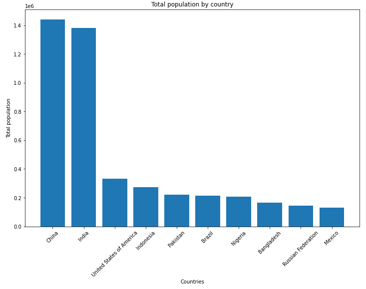
The matplotlib chart in our Jupyter environment.
Data Visualization Example With plotnine
plotnine is a Python data visualization library that’s based on the grammar of R’s ggplot2 package. If you’ve used R before, the plotnine functions will feel familiar. The core of the syntax uses the + sign to add new elements to a ggplot object:
| from plotnine import ggplot, geom_bar, aes, coord_flip, labs (ggplot(pop_medium_df[[‘Location’, ‘PopTotal’]][-10:]) + aes(x=‘Location’, y=‘PopTotal’) + geom_bar(size=20, stat=‘identity’) + coord_flip() + labs(y=‘Total population’, x=‘Country’, title=‘Total population by country’)) |
Here’s how the resulting graph looks in our Jupyter notebook:
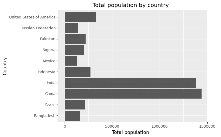
The plotnine chart in our Jupyter environment.
Other popular data visualization libraries for Python include Seaborn, Folium and Bokeh.
3 Tips on Creating Clear Data Visualizations
Regardless of your ultimate choice of library for creating data visualizations, it’s crucial to make the visualizations insightful and useful for your audience.
In this section, we provide three tips on making your data visualizations shine.
Tip 1: Avoid “Chart Crimes”
Charts are abundant in the finance world, and unfortunately some community members try to use charts to tell stories of questionable quality. An article by Sloane Ortel over at the CFA Institute blog showcases a few examples of charts that are misleading or unclear.
Many of Ortel’s examples use non-standard axes, like axes that don’t start at zero or that don’t increase linearly. Such unusual scales can be helpful to tell a particular story, but many people can find them difficult to interpret. Some other examples of misleading graphs combine two Y axes in the same chart while following different scales, making it even more challenging to understand whether the data supports a hypothesis or, on the contrary, disproves it.
Tip 2: Use Accessible Color Schemes
Colors can be a helpful tool to make a chart more easily readable. However, there are two reasons as to why you shouldn’t rely exclusively on color to communicate the results you need your reader to take away.
First, some of your readers will likely be color-blind. Check out the color blindness resources from WebAIM for examples of how color-blind individuals see. By over-relying on colors, you might be inadvertently precluding a significant part of the population from understanding your graph.
And second, there will be plenty of readers without color deficiency that will still not be able to see the colors as you intended: They may simply be using tools like iOS’s Night Shift that distort colors on screens.
When creating charts that make use of colorful elements, consider using an accessible color scheme. Websites like ColorSafe help generate color palettes that meet accessibility requirements.
Tip 3: Don’t Overuse Visualizations
At this point, you have hopefully tried out a couple of the Python visualization tools that we’ve shared. It might be tempting to use your visualization skills to showcase every interesting detail in your data set.
However, pay close attention to whether the task at hand will benefit from using a visualization, or whether having another visualization will distract your audience. Using too many charts in a webpage, report or article can overwhelm readers with information.
Instead, focus on providing a few key charts that illustrate your points and keep the rest of the information for the Additional Resources section.
Master Data Visualization With Python
The basics of data visualization in Python are quite straightforward, but there’s a lot more to learn.
Want to go beyond the basics of data visualization with Python?
Our online Data Analyst Nanodegree teaches you to use Python to generate insights, express critical findings and develop data-driven solutions.


