As many of you have noticed, we’ve been rolling out new identities across our various social networks… And now we’re pleased to roll out a new logo for Udacity, along with a cleaner design for the home page!
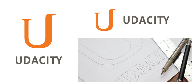
Our aesthetic continues to evolve to better represent our mission and values. Udacity is an evolution of traditional universities. Our new logo is a play on the old style serif “U” of many established universities. The right end transforms and rises, symbolizing Udacity’s forward progression and commitment to constantly innovating our students’ learning experience.
A streamlined sans serif font for “Udacity” reflects the simplicity we value in our user experience. Watch for more changes and improvements to the site in coming months!