Last Updated on October 23, 2024
In this brief guide, you will learn about the CSS Grid Layout system. Knowing how to use this CSS feature helps to not only define HTML content positions but also provides some great options for functional web design that does not force the use of floats.
In a previous article, the concept of How to Create a CSS Grid Container was covered. The core basics of setting up a CSS grid and its alignments were discussed. With this article, the goal is to build on those foundation points.
The subject of grid gaps, grid lines, and grid area templates will be covered to enhance the use of a CSS grid in your own designs. Sample code and images are provided to help you navigate the content.
If you are brand new to the world of web design, please check out the beginner’s guides here on Udacity. The posts HTML for Dummies and CSS Basics for Beginners will get you started.
Getting A Basic CSS Grid Setup
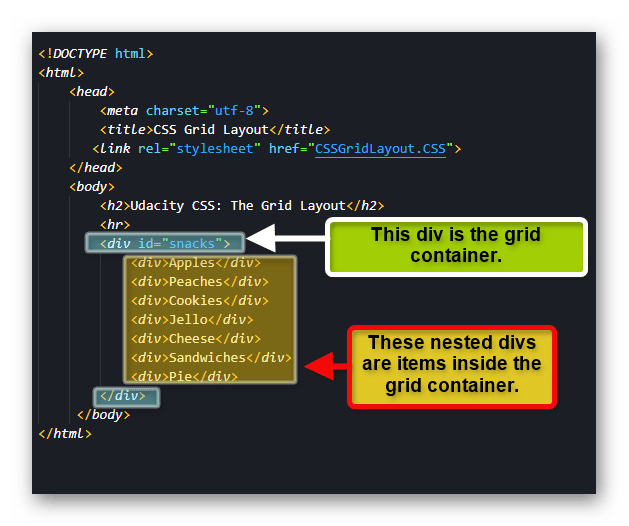
Before you work on the gaps and lines concepts, you should have a basic CSS grid ready for testing. In the sample HTML code below, you will see a div with an ID of “snacks” that is set up for use as a grid container. Within that div are several other divs nested inside.
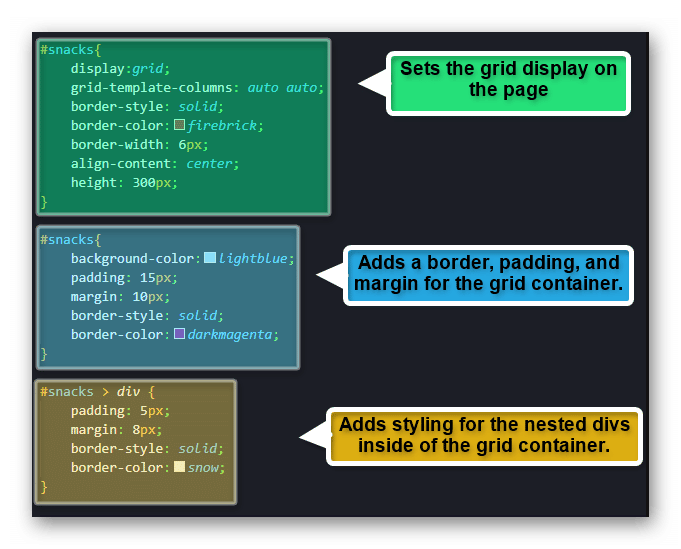
With the HTML content added, a bit of CSS work is provided to make the container stand out against the plain background. The styling is something you can change if you are following along.
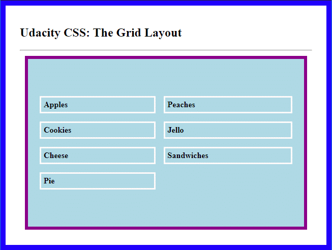
After the CSS styling is added, the page output should look like the image below.
The CSS Grid Gap
Now having the basic CSS grid container established, you can now start to look at other ways to alter the content within. One of these methods is the CSS grid gap properties. There are three variations for this method. You can see these listed below.
- grid-column-gap: Adjust the gap spacing between grid container columns.
- grid-row-gap: Adjust the gap spacing between grid container rows.
- grid-gap: This is a shorthand property for both columns and rows in a grid container.
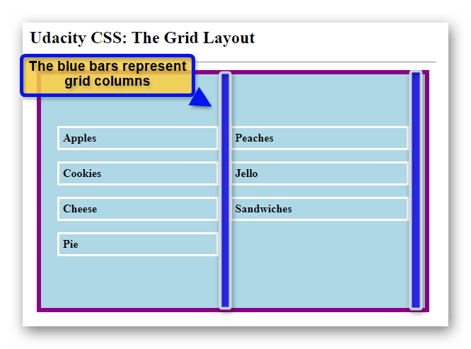
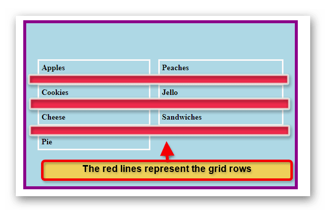
As a visual aid, the following images depict the columns and rows of the CSS grid container for the example.
Grid Columns:
Grid Rows:
Setting the Grid Gap Properties
Applying a gap to a grid column or row is an easy matter. You simply need to use the appropriate property for the area you want to alter.
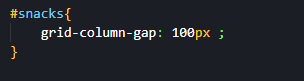
In the example below, the “grid-column-gap” property was used. A value of 100px (pixels) was provided to give a new gap spacing between the columns.
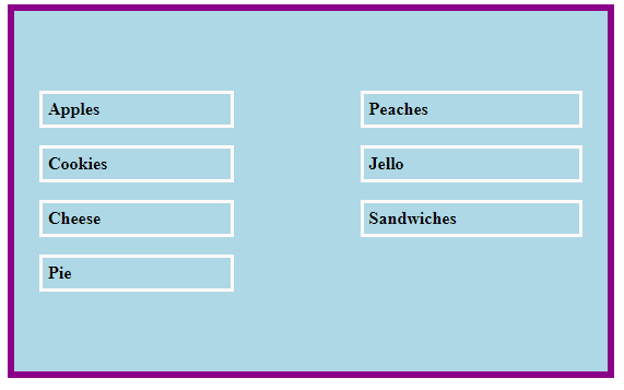
With the existing CSS work on the page, this rendered result is shown below.
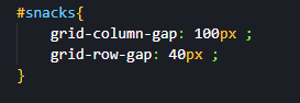
To alter the spacing in the grid’s rows, you do much the same. In this case, you replace the CSS property with “grid-row-gap” instead. In the example below this property has been used with a value of 40px provided.
Setting the grid-row-gap provides the following result on the page.
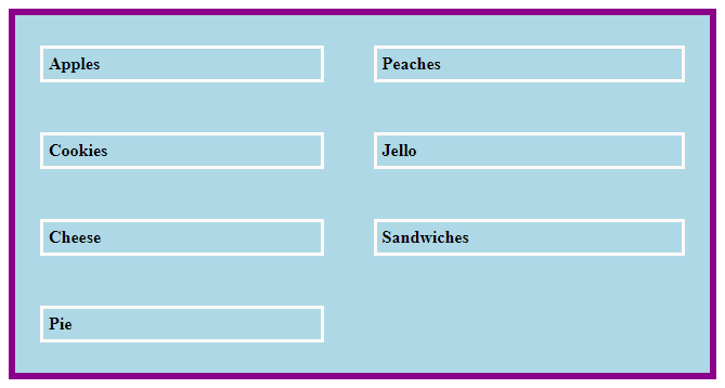
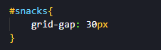
You also have the option of using the shorthand property to set both the column and row gaps at the same time. You can achieve this by using the “grid-gap” property. You can see in the example below it has been given the value of 30px.
Using the code above provides the following result on the page.
Setting Up Grid Areas
There are times where you will want to set up a grid with deeper refined positioning for specific elements. In these cases, it can be a great idea to use a grid area. A grid area allows you to specify how grid components will work within the grid container.
To access this option, you will have to use the “grid-template-areas” CSS property. This property will need a grid area name to reference. To get the name of a grid area you will need to use the “grid-area” property to set it up first.
In the HTML example code below, a new set of divs has been used inside the grid container. You may notice that each nested div also has a class added to it as well. The classes are used for easy reference in the next steps.
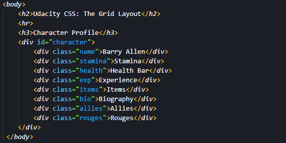
The new content is loaded on the HTML page.
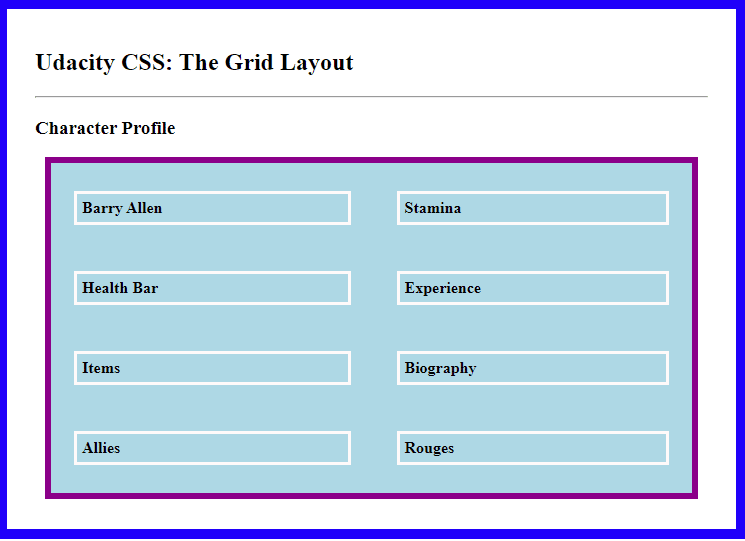
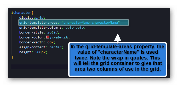
In the sample grid, the character name should stand out. To make this happen, you can set the div class “name” as a grid area. In the example CSS below, the name class has been given the property of grid-area. The value of grid-area is set to “characterName” for the example. You can set the name as anything you would like. It is simply a point of reference for the grid-template-areas property.

On its own, setting the grid-area will not do anything to the way the content is displayed. The next step is to tell the grid container how you want that specific grid area to behave.
You can set this up by using the grid-template-areas property and feeding it the grid-area name you used as a value. The value should be wrapped in quotes as well. See the CSS example below for a demonstration.
Using the grid-template area, as shown above, will give the following result on the page.
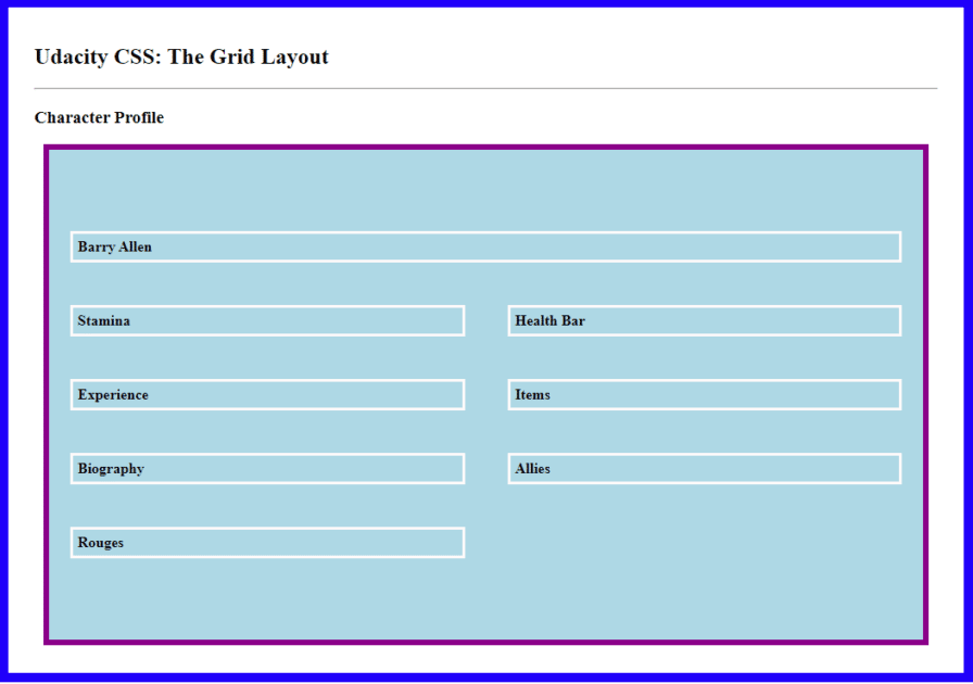
In the code example above, you can see that the grid-template-columns property is set with a value of auto twice. Using this format will tell the grid to have two columns to work with. However, if you did not set that property, the grid-template-areas property can still make it work for you.
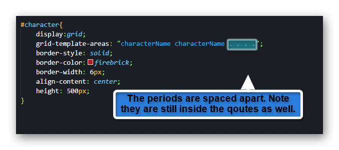
In the CSS example below, take notice of the four trailing periods behind the set grid-area name. Adding these extra characters will tell the grid that you are letting the characterName grid area take two columns as well as stating that there are four other columns. Essentially, the named grid area will take two out of six columns available.
Applying the extra periods will give the following grid appearance on the HTML page.
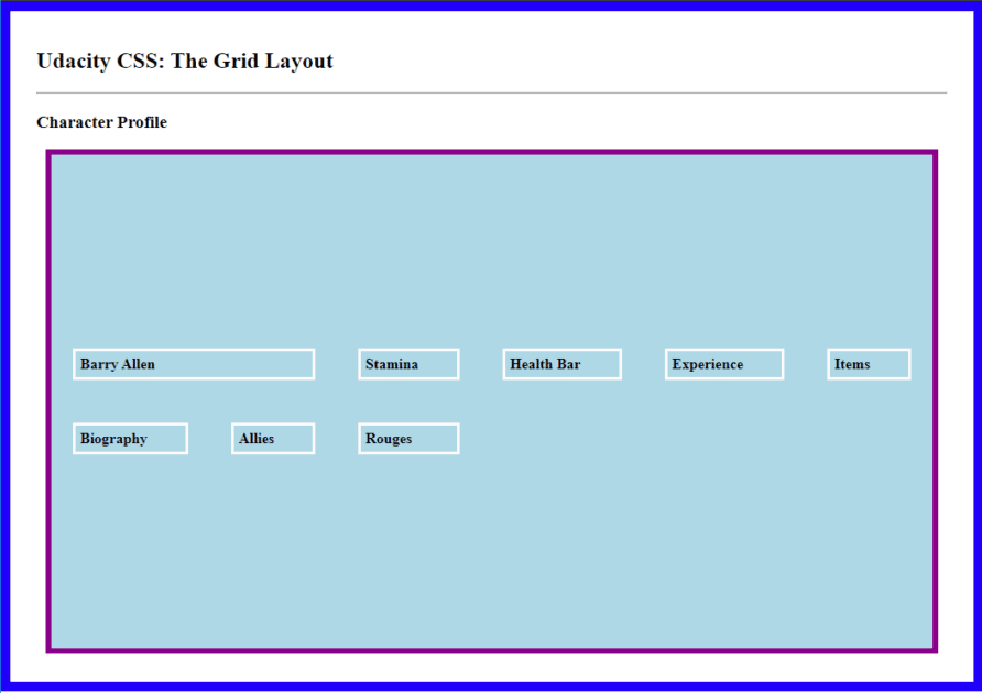
You can see the grid has automatically arranged itself to accommodate both the grid-template-area values as well as the other CSS styling properties in effect. This example is just one of many ways you can style your own grid for functionality. Knowing what the grid is going to be used for and how the end-user will interact with it is key to understanding what property values make the best sense to use.
___________________________________________________________________________________________________
Why Not Go Even Higher?
Why stop at just CSS grid creations? The creative ability in programming is allowing people to do even more with their ideas. If you want to advance your career, take the first steps by learning to code. Having these skills can help you open doors to those new professional possibilities. Enroll in Udacity’s Intro to Programming Nanodegree today to start the journey.