Lesson 1
Why Responsive?
Pete Lepage, Developer Advocate at Google, explains why responsive design is so important and helps you set up your development environment.

Course
Learn and practice strategies for developing websites that look great on every device! Made with Google's Pete LePage.
Learn and practice strategies for developing websites that look great on every device! Made with Google's Pete LePage.
Last Updated March 4, 2022
Prerequisites:
No experience required
Lesson 1
Pete Lepage, Developer Advocate at Google, explains why responsive design is so important and helps you set up your development environment.
Lesson 2
Dive into the specifics of how pixels on a webpage are rendered and how that impacts the development process.
Lesson 3
Learn the most important tools in developing any responsive web application: media queries and flexbox.
Lesson 4
Walk through the most popular responsive layout patterns and learn the tools needed to implement them in your own designs.
Lesson 5
Learn how to optimize images, tables, and fonts to make for the best responsive layouts.

Developer Advocate at Google

Software Engineer at Jacobs
Combine technology training for employees with industry experts, mentors, and projects, for critical thinking that pushes innovation. Our proven upskilling system goes after success—relentlessly.

Demonstrate proficiency with practical projects
Projects are based on real-world scenarios and challenges, allowing you to apply the skills you learn to practical situations, while giving you real hands-on experience.
Gain proven experience
Retain knowledge longer
Apply new skills immediately

Top-tier services to ensure learner success
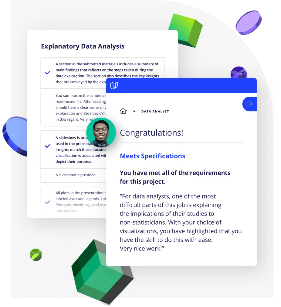
Reviewers provide timely and constructive feedback on your project submissions, highlighting areas of improvement and offering practical tips to enhance your work.
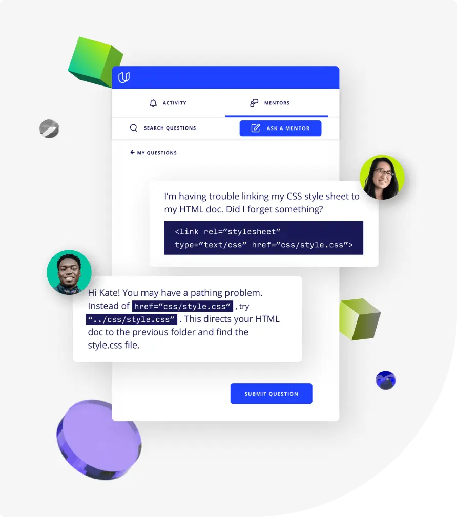
Get help from subject matter experts
Learn industry best practices
Gain valuable insights and improve your skills
10 hours
5 hours
7 hours
10 hours
8 hours
18 hours
12 hours
10 hours
2 hours
2 hours
8 hours
1 month
, Beginner
Learn the fundamentals of responsive web design and practice strategies for developing websites that look great on every device. You’ll start by exploring what makes a site responsive and how some common responsive design patterns work across different devices. From there, you’ll learn how to create your own responsive layout using the viewport tag and CSS media queries. As you proceed, you’ll experiment with major and minor breakpoints, and optimizing text for reading.