Last Updated on October 23, 2024
In this introductory tutorial on Margins and Padding in CSS and HTML, we will explore some easy to use, creative applications to further enhance your ability to add space around an element. You may want to add space around an image or extend space between the web page border and the text you are displaying.
Additionally, we will explore the different levels of spacing and come to truly understand the difference between Margins and Padding in CSS. Within that realm, we will also explore the many custom options you have to set the margins and padding with precise measurements.
The Difference Between Margins and Padding
Margins
Margins control the spacing width between the edges of your web page and the element itself.
The following are the four property options:
- margin-top
- margin-right
- margin-bottom
- Margin-left
The margin syntax options are:
- margin-top: <length> | <percentage>
- margin-right: <length> | <percentage>
- margin-bottom: <length> | <percentage>
- margin-left: <length> | <percentage>
Padding
Padding controls the area immediately around your element.
The following are the four property options:
- padding-top
- padding-right
- padding-bottom
- Padding-left
The padding syntax options are:
- padding-top: <length> | <percentage>
- padding-right: <length> | <percentage>
- padding-bottom: <length> | <percentage>
- padding-left: <length> | <percentage>
To get a better understanding of where exactly padding and margins fit around an element, we can consider the box diagram.
Margins are on the outside. Think of the margins you use on a piece of paper. These margins give space away from the edge of the paper. In HTML margins work the same way in giving space away from the edge of the page.
Borders simply wrap the element. A border can wrap immediately around an element, or it may look further away from an element if more padding has been applied to the element.
Padding provides space around the element. Think of wearing a heavier jacket in winter. The thicker the jacket, the more padding you have around you. And you, in this case, are the element.

Defining Margins and Padding
Using Numerical Values in Pixels
How do we calculate pixels? Display resolution indicates how many pixels are contained in a screen. For example, a 1080×1920 display is simply a grid that is 1080 pixels tall and 1920 pixels wide. On your web page. As we get into adding pixel dimensions, you will want to play with different numerical values to adjust the results that fit your needs.
In the following code for the image property, we set the:
- image width to 300px
- border to 2px
- padding to 0px
- margin to 0px
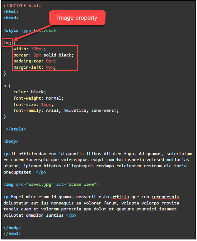
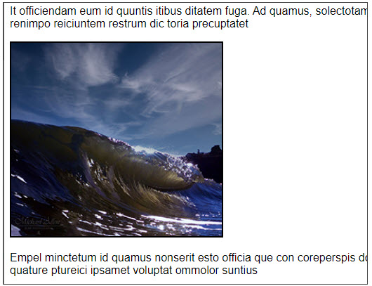
The web output looks as follows:
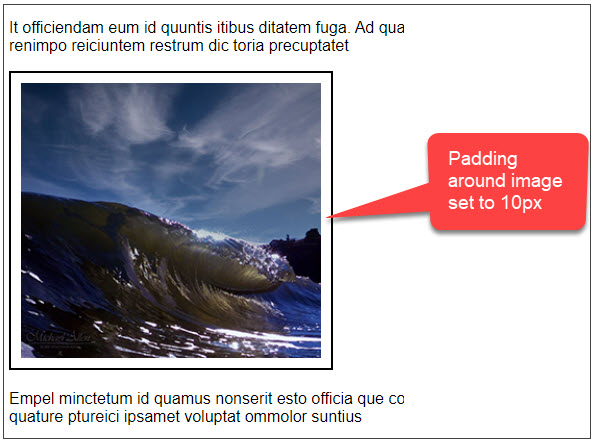
If we increase the padding we see the border move further away from the image because the padding property is first to wrap the element.
<style type=text/css> border: 2px solid black;padding: 10px; width: 300px; margin-left: 0px; } |
The web output looks as follows:
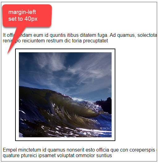
If we increase the margin, in this case setting the margin to increase only on the left side, we will get a web output as follows. As you can see, the left margin pushed the image to the right by 40px.
You can play with assigning numerical values in pixels to different sides of the box for padding and for margin.
<style type=text/css> |
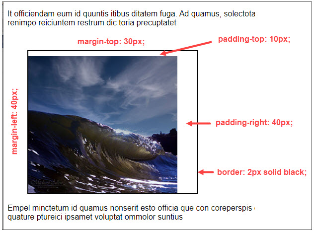
The web output looks as follows. You can see that you have the ability to be creative and have the power to control the spacing at all levels. Here we have:
- Defined the space between the image border and the text by defining the top margin.
- Defined the left margin.
- Defined the top padding between the image and the border.
- Defined the right padding between the image and the border.
- Defined the border thickness surrounding the image.
Values In One Row
Instead of writing out each side of the margin as:
img { |
You can write this out on one line.
In a list of the above four values, this would be written as follows:

- The first value always equals the top: 40px
- The second value always equals the right: 100px
- The third value always equals the bottom: 120px
- The fourth value always equals the left: 80px
TIP: You can use one, two, three, or four values to define your margins.
- When one value is specified, it applies the same margin to all four sides.
- When two values are specified, the first margin applies to the top and bottom, the second to the left and right.
- When three values are specified, the first margin applies to the top, the second to the right and left, the third to the bottom.
- When four values are specified, the margins apply to the top, right, bottom, and left in that order (clockwise around the box).
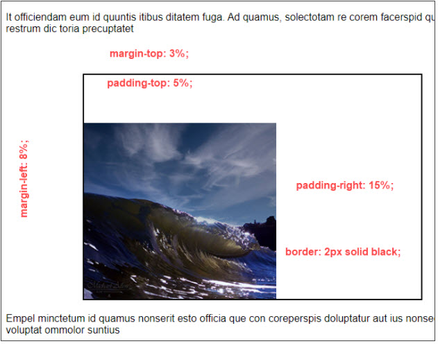
Using Percentages as Values
We can perform the same margin and padding settings using percentages instead of numerical values in pixels.
img { |
The web output looks as follows.
Also, see: HTML/CSS Class and ID Selectors for web customization options to enhance blocks of text. Use this in conjunction with Margins and Padding to create a more stunning web page.
Where to Next?
This introduction to Margins and Padding should provide a starting point for further inquiry into the unlimited creative aspects that HTML offers. We will continue to explore other areas of HTML design in the next blog. We hope this introduction has piqued your interest and inspired you to explore further and dive deeper into the world of web design. Enroll in our Intro to Programming Nanodegree program today!

