Last Updated on October 23, 2024
We know a great many of you are knee deep in Web Development projects as we write this, and any time we have the opportunity to pass on some expert insights and resources, we don’t hesitate to do so. Today, we have an awesome post from Rohit Boggarapu, who is a software engineer at Adobe. He’s written a great article on the best data visualization tools and charting libraries for web developers, and we encourage you to read it, as it’s got some great information.
The gap between data and our interpretation of it can be huge, especially when it means squinting at rows of unintelligible figures in spreadsheets (possibly the least appealing format of all time).
Web developers don’t really get along with spreadsheets. Now, they no longer have to, for there are far sexier ways to chart data. Yes, the necessary evil that was the static Excel chart isn’t the only option any more.
There are many things to consider when choosing the right data visualization or charting tool for your project. In this article, I’ll be giving you a direct rundown of 12 of the best data visualization tools for web developers to help you stop struggling against data and start graphing.
Google Charts
The huge library of information available with Google Charts makes it a fantastic starting point for anyone looking to get started charting with JavaScript. The documentation has heaps of commented code and step-by-step instructions you can use to embed HTML5 / SVG charts into your web pages.
If you’re looking for advanced customization and more charts than Google’s native 18, below a—re some better options with more types and features.
Best for: Serious developers looking for a flexible, well-documented solution.
MetricsGraphics

MetricsGraphics is a charting library built on D3.js but optimized for visualizing and laying out time-series data. Although it is restricted to just line charts, scatterplots, bar charts, histograms and data tables, it does these few things incredibly well.
Similar to Google Charts (Metrics Graphics is a Mozilla product), there is tons of useful documentation and example code on their site, making it easy for beginners to dive in.
While it is a simplified solution, it’s lightweight and quickly learned, thanks to a fun, interactive example that they provide (UFO sightings, eh?).
Best for: Developers who want a quick, beautiful solution without wading through a mess of code to get there.
FusionCharts

FusionCharts supports vanilla JavaScript as well as jQuery, Angular and other popular libraries/frameworks. With over 90 charts and 1000 maps it’s a more complete solution than Google Charts or MetricsGraphics by a long shot. Check out the tech specs to see the full list of charts provided.
When considering the scalability of your app or web page, it is important to remember that picking a data visualization tool that isn’t fully complete can come back to bite you. FusionCharts is used by companies such as Microsoft, Google and IBM, so it is obviously a scalable tool, even for enterprise requirements.
Best for: Developers who need a huge range of easily customizable charts.
Epoch

Epoch is a tool built on d3.js, specifically so that developers can use real-time charts in their apps or on their web pages. Neatly documented, Epoch is 100% free and open source, so it’s a good option if you don’t want to financially commit to a more heavyweight solution.
With 5 chart types for both basic and real-time, Epoch doesn’t stand up against fully featured products like FusionCharts or Highcharts, but it excels at representing real-time data in a simple and accessible way.
Best for: Simple and flexible real-time charting.
ECharts

Baidu’s ECharts is an awesome tool for manipulating data once it’s charted because it has one unique feature: Drag-Recalculate allows users to drag and drop sections of data from one chart to another and have the charts recalculate in real-time. Not to mention the fact that ECharts is made for big data and can instantly plot up to 200,000 points on a Cartesian chart and bring it to life with ZRender, a lightweight canvas library made specifically for ECharts.
Best for: Code-free, real-time data manipulation with its unique recalculate feature.
D3.js

While it’s not the most user-friendly tool, there is no denying that d3.js is a force to be reckoned with in the JavaScript charting world. Plenty of other libraries expand on it because it has every feature you’ve come to expect, it supports HTML, SVG, and CSS and, while it doesn’t come with out-of-the-box charts, it includes an overwhelming amount of user-created contributions.
Considering that D3.js is pretty hard to learn, it’s worth checking out this course on data visualization and d3.js, which is as much of a solid rundown on the fundamentals as you could ask for.
Best for: Hardcore charting experts not afraid to code.
Sigma
Sigma’s a bit of a niche when compared to the rest of the tools covered so far in this list because it is dedicated to graph drawing. It’s built on Canvas and WebGL and has a public API, so it has a range of plugins contributed by the community on GitHub. Here’s an example of what you can do with Sigma js:
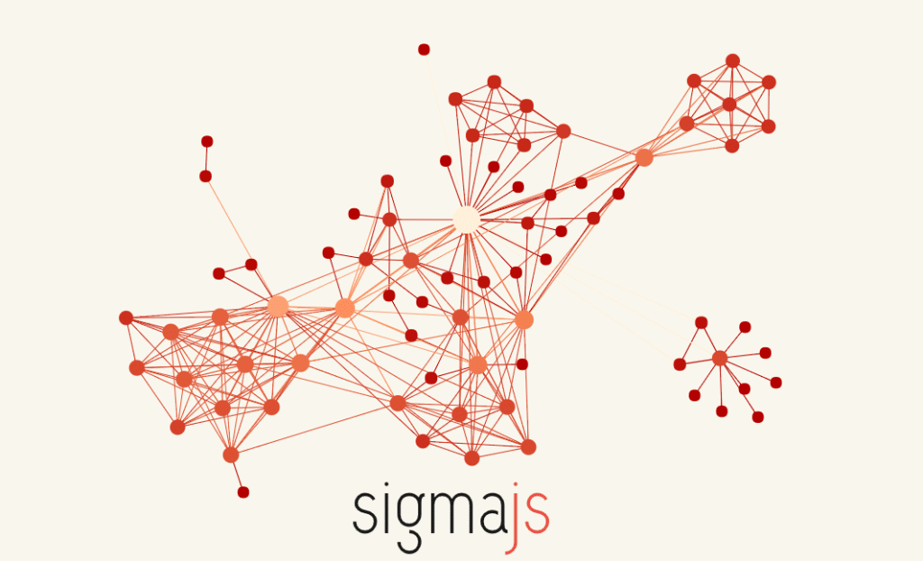
Sigma is fully responsive, touch interactive, and allows developers to directly add their own functions to the scripts and render nodes and edges exactly to spec.
Best for: Developers who need a powerful, dedicated graph drawing tool.
Highcharts
The wildly popular Highcharts can create interactive charts without relying on plugins. In fact, Highcharts’ flexible charting API is trusted by companies like Nokia, Twitter, Visa, and Facebook.
Highcharts is free for non-commercial use, but as soon as you want to start making money off it (and get support while you do it), it’ll set you back $590 per developer licence.
Here’s an example of a chart created with the tool:
If you want to learn how to start using Highcharts, check out this great quick tutorial.
Best for: Developers who want to create charts of any complexity with the tech support that comes with a premium product.
dc.js
dc.js is an open source, dimensional charting JavaScript library perfect for making interactive dashboards. The charts are relational, so when you interact with one section of the dashboard, the rest reacts to drill down to that particular data point. Here’s an example:

Aside from a few online courses, the library is taught entirely through this example, so by going through their documentation you’ll be able to create your own version.
While dc.js can’t create charts as varied as some of the more fully featured tools in this list like ECharts or Google Charts, it focuses on its USP—exploration of large multidimensional dataset—incredibly well.
Best for: Developers who need a dashboard of relational charts for their project.
dygraphs

An absolute gem of a data visualization tool, dygraphs was originally developed at Google and is used to this day on Google Correlate (with a few design tweaks, of course). It can be used for intensive projects because it can plot millions of data points without slowing down, which makes its stripped-back design a forgivable flaw.
From being an internal Google tool to going out into public, dygraphs is actively supported and developed by the community, and the source is open to view on GitHub.
Best for: Developers looking for a dedicated, actively supported tool for plotting large data sets.
Vega

Vega is a d3.js based library for creating, sharing and saving data visualization designs. It is made up of toolkits and systems including some that rival d3’s power without the need for writing code. Vega translates JSON into SVG or HTML5 graphics which—although nothing fancy in this case—definitely gets the job done.
Since Vega doesn’t require any programming (just the ability to edit values in a JSON file) it’s a great alternative to the complexity of d3 while retaining the features.
Best for: Developers who want the power of d3 without the complexity of learning it from scratch.
NVD3
The last tool on this list is built on d3, which is the forerunner of most open source data visualization tools. NVD3 is a collection of components that allow developers to create reusable charts. A variety of demos and their code can be found on the NVD3 examples page, and that’s the best way to go about learning it, too.
As you can see, NVD3’s style is slightly more refined than its parent’s:

It supports 11 types of chart including area, line, bar, bubble, pie, and scatter and is compatible with all modern browsers and IE10 onwards.
Best for: Developers with d3 knowledge who want reusable charts.
—
Which is the best data visualization tool for me?
If you’re looking for some more information on which data visualization tool is right for you, check out this comprehensive comparison page for all the techie details. While this list is aimed at web devs, some of these tools are so easy to use you don’t need to be a developer to get work done out of them. With the range of interactive examples available on-site, customizing the code is easy even for someone who is just getting into web development.
Want to learn even more? Enroll in our Data Visualization Nanodegree program.

