Last Updated on October 23, 2024
Exploratory data analysis is a critical part of any data analytics or data science process. Before a data scientist starts diving into answering questions with data, they need to know something about the data they are working with. Knowing how to do exploratory data analysis with Python will enable you to provide your data team with an initial view of the data at hand.
In this article, we will review what it means to perform exploratory data analysis with Python and then look at the two types of data: categorical and numerical. For each, we will consider two main categories of exploratory data analysis: graphical and non-graphical.
What is exploratory data analysis?
Many people who travel to a new city will explore upon arrival by looking at a map or by walking and driving around to get a feel for the main landmarks. They may spend time looking up interesting things like restaurants, parks, etc. to get an idea of what the city has in store for them once they go deeper.
Exploratory data analysis is a similar process whenever we get a new dataset: we want to get a high-level view of the data as well as browse around a bit and see what might be interesting. We do this with a combination of graphical and non-graphical tools.
The most interesting thing we want to learn about categorical data is summarizing counts of data values. For numerical data, the interesting things include finding the center, spread, and shape of the distribution of values. In the sections below, we will look at the two different types of data described here using both graphical and non-graphical methods.
Sample data.
In the sections below, we will use a sample of data downloaded from Kaggle Datasets. Specifically, we are looking at the data from 2013 that is contained in the 2013.csv file.
Categorical data.
Sometimes data represents categories of items and is sometimes called either categorical or qualitative data. Examples include educational level (“high school diploma,”, “bachelor’s degree,” “graduate degree”); hair color (“brown,” “black,” “blonde,” “red”); or even binary conditions such as current customer status (“yes,” “no”).
The characteristics of interest for categorical data when doing exploratory data analysis with Python include the range of values as well as the frequency or duplicate/uniqueness of values. Let’s look at some non-graphical ways of exploring these characteristics.
Non-graphical methods.
One of the first things we might want to do with a dataset is to get an idea of the shape of the data (number of rows x number of columns) as well as get a list of the column names. The code below does this for us. This dataset has over 6 million rows of data and 28 columns.
# Shape of the data frame and column headers
display(df.shape)
display(list(df.columns))

Next, let’s look at some of the categorical fields. OP_CARRIER is the abbreviation for the airline and ORIGIN and DEST are the beginning and ending airport codes for each flight in the dataset. These are all categorical data fields. This line of code will print out the range of values for the OP_CARRIER field.
# Show values in some categorical columns
display(df['OP_CARRIER'].unique())

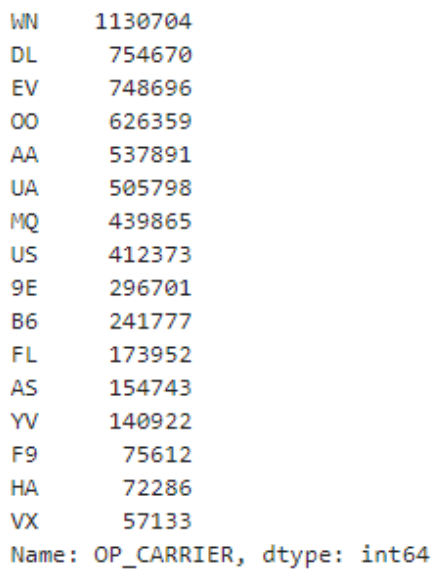
Now that we know the range of values, let’s find out how many of each of these is in the dataset. Remember, there are over 6 million rows of data so we expect a lot of duplication here! This line of code shows how to get the count of duplicate values in the OP_CARRIER column. The first column of the results is the OP_CARRIER code and the second column is the number of duplicates of that value.
# Find duplicates
df['OP_CARRIER'].value_counts()
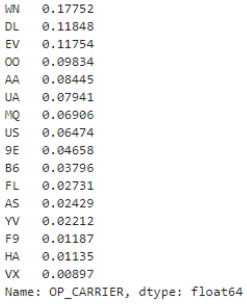
Rather than just using the raw counts, we can also easily calculate what percentage of the total column each value represents using the “normalize” parameter. The code below demonstrates this technique.
# Find percentage of total
df['OP_CARRIER'].value_counts(normalize=True)
The above techniques allow us to quickly and easily get a sense of the types of values in categorical columns as well as get a sense of the counts of these values.
Graphical methods.
Graphs and charts allow us to visualize data in more intuitive ways than simple text. One of the best ways to graphically view categorical data is using a bar graph. For example, in the last step above, we printed out a list of duplicate counts. The code below plots these counts from highest to lowest so we can more easily compare the results.
# Bar graph of value counts
df['OP_CARRIER'].value_counts().plot(kind='bar')
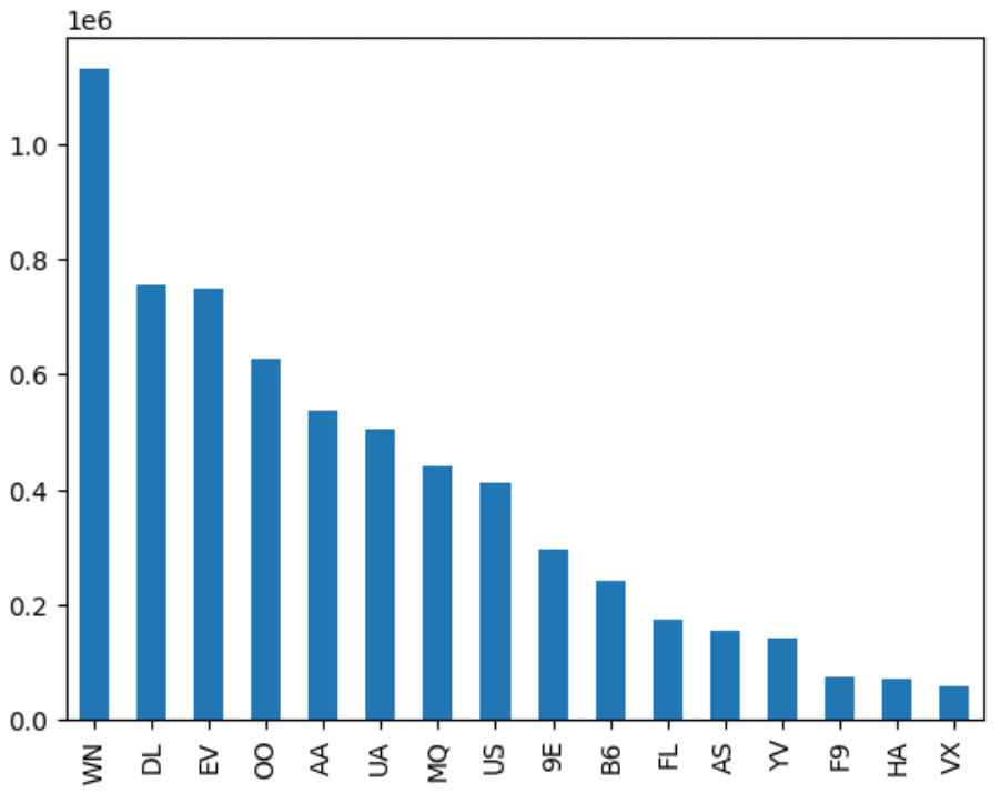
You can see how we get the same information from both the text and graphical representations but the graph makes it easier to see the “shape” of the data. Whether we are using text or graphical representations, the goal of exploratory analysis of categorical data using Python is to get a feel for the values and counts of values in the dataset.
Numerical data.
Data that is represented by numbers is sometimes called quantitative or numerical data. These numbers sometimes represent simple counts (as we saw with categorical data) but they can also be continuous variables where the values lie in a range.
Examples of this type of data include common values such as height, weight, sales totals, length of time, and distance traveled. Numerical data values show up in nearly every domain so it is useful to learn how to explore this type of data.
The characteristics of interest for quantitative or numerical data include measures of centrality, spread, and distribution shape. Measures of centrality tell us where the values in the data are centered. The most common measure is the mean or average. Another common measure is the median or middle value of the data. Spread refers to how varied the values are in the dataset. Are most of the values clustered around a small set of values or are they spread out across a wide range? This is related to the shape of the distribution and here, skew and kurtosis measures tell us important details about how the values are distributed across the range of values. Let’s look at some ways of exploring numerical data.
Non-graphical methods.
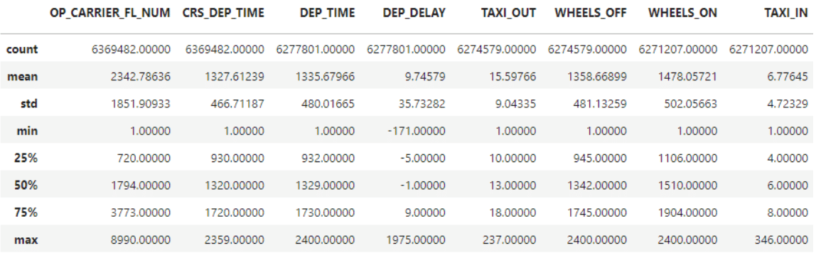
A simple way to get a non-graphical view of your dataset in pandas is to use the describe() method on your dataframe. This method will produce several interesting descriptive statistics for all numerical columns. These include:
- Count – a count of non-empty values in the column
- Mean – the average value of the column
- Std – Standard deviation (a statistical measure of the spread of the data)
- Min, Max – the lowest and highest values of the column
- 25%, 50%, 75% – the values that represent the percentile rank within the column
These are common measures that most applied statisticians can quickly scan to get a sense of the data they are going to work with.
Here is the code and a snippet of the output for the dataset.
#Describe the numerical columns
df.describe()
While this information is useful, skew and kurtosis are often helpful for applied statisticians to get a sense of the shape of the distribution. By themselves, the numbers may not be meaningful if you don’t have a statistical background but they are simple numbers to calculate using pandas (and we will see visual representations of these values below.) Here is the code to calculate the values:
#Skew and Kurtosis
df['ACTUAL_ELAPSED_TIME'].skew()
df['DEP_TIME'].skew()
df['ACTUAL_ELAPSED_TIME'].kurtosis()
df['DEP_TIME'].kurtosis()
Graphical methods.
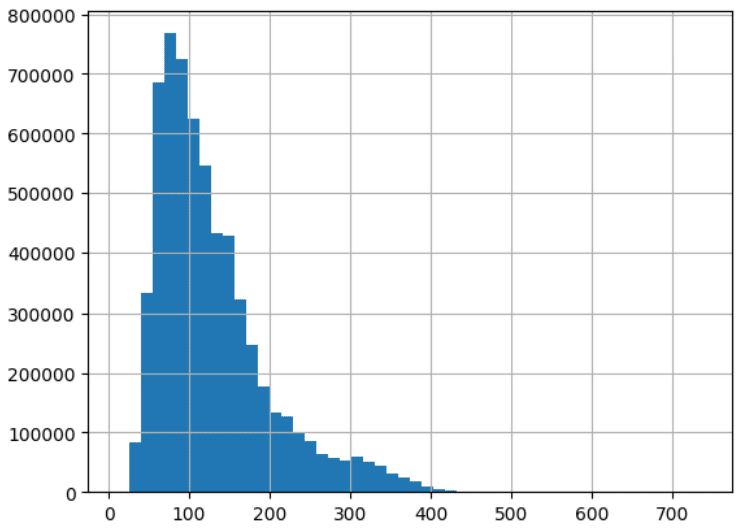
One of the most useful ways to visualize numerical data is the histogram. This graph collects values that are similar to each other in “bins” and then graphs the relative frequency of the values that fall within each bin. The code below shows the histograms for the two columns for which we calculated skew and kurtosis above:
#Histograms
df['ACTUAL_ELAPSED_TIME'].hist(bins=50)
df['DEP_TIME'].hist(bins=24)
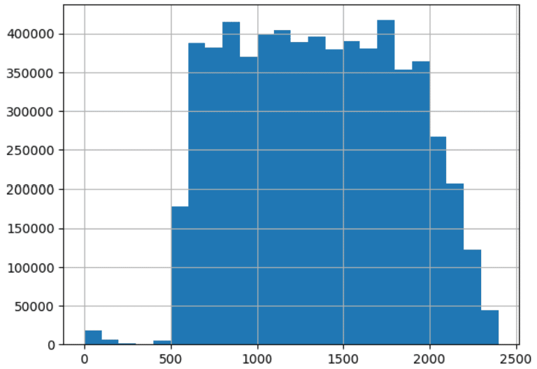
Notice how the graphs show a different shape for the distribution of values. Compare these shapes with the values calculated above for skew and kurtosis. One of the best ways to gain an intuitive sense of what these terms mean is to calculate the numbers and then generate a histogram and compare them. Also, notice the histogram gives us a visual representation of both central tendency and spread. These graphs are invaluable to a data engineer doing exploratory data analysis using Python.
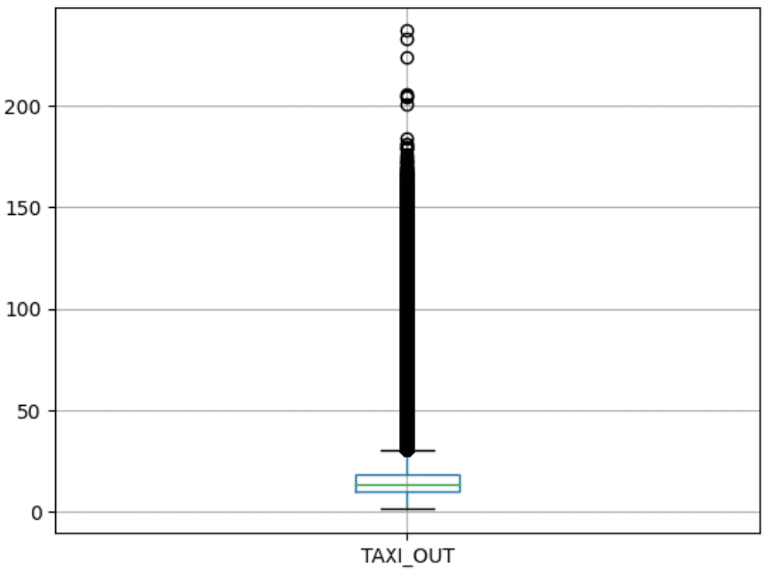
Another powerful graph for visualizing numerical data is the boxplot graph. This graph combines the mean and percentile numbers we saw from the described method with a visual demonstration of outliers. Outliers are data points that are abnormally far away from the center of the data. The following code shows the boxplot graph of the TAXI_OUT column.
#Box plot
df.boxplot(column=['TAXI_OUT'])
In conclusion.
In this article, we have examined both categorical and numerical data and we have explored both non-graphical and graphical methods for conducting exploratory data analysis using python. These methods will get you started in providing valuable information for data scientists and statisticians hoping to use the data you are preparing for them.
Ready to step up your data engineering skills? Learn to code with Udacity.
Exploratory data analysis with Python is a critical skill for any Data Engineer in a modern data science environment. In this article, we explained what it means to conduct exploratory data analysis and then we explored non-graphical and graphical methods to explore both categorical and numerical data.
Our Programming for Data Science with Python Nanodegree program is your next step. We’ll teach you how to work in the field of data science using the fundamental data programming tools: Python, SQL, command line, and git.