
Lesson 1
Welcome to the Data Visualization Nanodegree program
Welcome to the Data Visualization Nanodegree program! In this lesson, you will learn more about the structure of the program and meet the team.

Nanodegree Program
This Data Visualization Nanodegree program covers four courses on data visualization and storytelling. Students will learn to select appropriate visualizations, design effective dashboards, and tell data stories that uncover insights and make recommendations. They will use Tableau to build interactive dashboards and create polished presentations with data visualizations. Through a series of projects, students will learn to discover user needs, identify key metrics, prototype, and design dashboards, analyze data to find insights and communicate recommendations effectively.
This Data Visualization Nanodegree program covers four courses on data visualization and storytelling. Students will learn to select appropriate visualizations, design effective dashboards, and tell data stories that uncover insights and make recommendations. They will use Tableau to build interactive dashboards and create polished presentations with data visualizations. Through a series of projects, students will learn to discover user needs, identify key metrics, prototype, and design dashboards, analyze data to find insights and communicate recommendations effectively.
Beginner
5 months
Real-world Projects
Completion Certificate
Last Updated January 8, 2024
Course 1 • 1 hour
Lesson 1
Welcome to the Data Visualization Nanodegree program! In this lesson, you will learn more about the structure of the program and meet the team.
Lesson 2
You are starting a challenging but rewarding journey! Take 5 minutes to read how to get help with projects and content.
Lesson 3
What to do if you have questions about your account or general questions about the program.
Lesson 4
Welcome to the Data Visualization Nanodegree program! In this lesson, you will learn more about the structure of the program and meet the team.
Course 2 • 1 week
Learn how to select the most appropriate data visualization for an analysis. Learn how to evaluate the effectiveness of a data visualization and build interactive and engaging Tableau dashboards.
Lesson 1
In this lesson you learn to evaluate the quality of data visualizations and build high quality visualizations, starting with the fundamentals of data dashboards.
Lesson 2
In this lesson you learn to implement the best design practices, and to use the most appropriate chart for a particular situation.
Lesson 3
This lesson teaches you how to build data visualizations in Tableau using data hierarchies, filters, groups, sets, and calculated fields, as well as create map-based data visualizations in Tableau.
Lesson 4
In this lesson you learn how to build interactive Tableau dashboards and tell impactful stories using data.
Lesson 5 • Project
In this project, you’ll build interactive dashboards with Tableau and use them to discover and communicate insights from data.
Course 3 • 4 weeks
In this course, you’ll learn the process of designing and creating dashboards within an enterprise environment. You’ll learn to discover user needs, identify key metrics, and tailor your dashboard to a particular audience. You’ll learn to use design elements to maximize the effectiveness of the dashboard and how to iterate based on user feedback.
Lesson 1
In this lesson, we introduce the topic of Dashboard design, take a look at the outline for the course, and take a sneak peek at the final project.
Lesson 2
In order to design a dashboard that meets our users needs we need to first understand what they are after and what are their pain points. Early discussions are critical in the planning phase.
Lesson 3
Students will learn about the design phase of creating their dashboards. This includes considering graphicacy, chart choice, visual hierarchy. Tools like sketching and wireframing are practiced.
Lesson 4 • Project
In this project, you will build a dashboard prototype along with sketches and wireframes for the prototype. The dashboard will be designed based on the Superstore database from Tableau.
Lesson 5
In this lesson, students will learn how to design the final dashboard by attending to the text hierarchy, affordance, interactivity of the dashboard, annotations, and color scheme.
Lesson 6 • Project
In this final project, students complete the dashboard they designed in the mid-point. They will add color, annotations, interactivity and make it production ready.
Course 4 • 1 month
In this course, you will learn the end-to-end process for telling a story and providing a recommendation based on data. You’ll learn to create a “ghost deck” to define a problem statement, scope possible analyses, and outline a set of potential solutions, along with next steps. You’ll also learn to identify what type of data analysis tool is appropriate for specific types of visualizations. You will learn how to identify limitations and biases in data. Lastly, you’ll learn to create a polished deck that uncovers the story from within the data through data visualizations.
Lesson 1
In this lesson, we will introduce the topic of Story Telling and also go over the course outline, including a sneak peek at the 2 projects that are part of the course.
Lesson 2
In this lesson students will understand how to clearly articulate the problem statement that is driving the analysis, and why it matters.
Lesson 3
In this lesson students will learn to build an analysis roadmap to stay efficient with your analysis time. An analysis roadmap consists of two key elements: (1) an issue tree and (2) a ghost deck.
Lesson 4 • Project
In this mid-term project, apply the skills in structuring a data story on a Movies Metadata and practice defining your own problem statement and the analyses you plan to do.a
Lesson 5
The data you work with is flawed and in this lesson students will learn where bias can be introduced in the collection, processing, and analysis process and call these caveats out.
Lesson 6
This lesson ties everything together. It covers effective visualizations depending on the problem you are solving, and reviewing a data presentation end to end.
Lesson 7 • Project
Building on the ghost deck, you will perform various analyses to identify the limitations and biases in data that affect the recommendations, and you will now create a final presentation.

Content Developer
Mat is a former physicist, research neuroscientist, and data scientist. He did his PhD and Postdoctoral Fellowship at the University of California, Berkeley.

Data Visualization Consultant at IBM
Robert is a Data Visualization consultant with over 7 years of experience leveraging Tableau at places such as First Republic Bank, Charles Schwab, and Pinterest. He now provides solutions to clients all over the world, providing training to professionals and executing projects onsite and remotely.

CEO of DataLiteracy.com
Ben Jones is the founder & CEO of Data Literacy, LLC, a training company that helps people learn the language of data. Ben teaches data visualization theory at the University of Washington, and he's the author of Communicating Data With Tableau (O'Reilly 2014).

Senior Product Manager at CircleUp
Malavica is a Senior Product Manager with over five years of experience. Her work includes building Helio, an ML platform used to identify breakout brands in early-stage consumer packaged goods companies.

Staff Data Scientist
Josh has been sharing his passion for data for over a decade. He's used data science for work ranging from cancer research to process automation. He recently has found a passion for solving data science problems within marketplace companies.
Average Rating: 4.6 Stars
124 Reviews
Combine technology training for employees with industry experts, mentors, and projects, for critical thinking that pushes innovation. Our proven upskilling system goes after success—relentlessly.
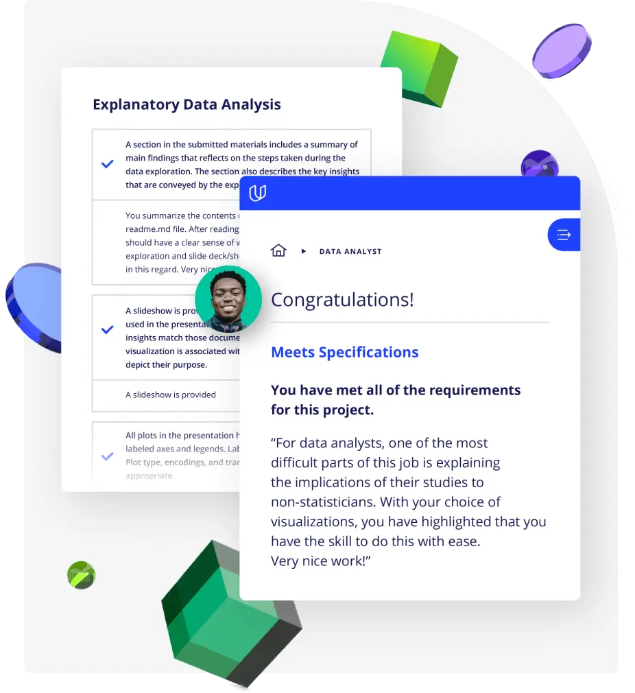
Demonstrate proficiency with practical projects
Projects are based on real-world scenarios and challenges, allowing you to apply the skills you learn to practical situations, while giving you real hands-on experience.
Gain proven experience
Retain knowledge longer
Apply new skills immediately
Top-tier services to ensure learner success
Reviewers provide timely and constructive feedback on your project submissions, highlighting areas of improvement and offering practical tips to enhance your work.
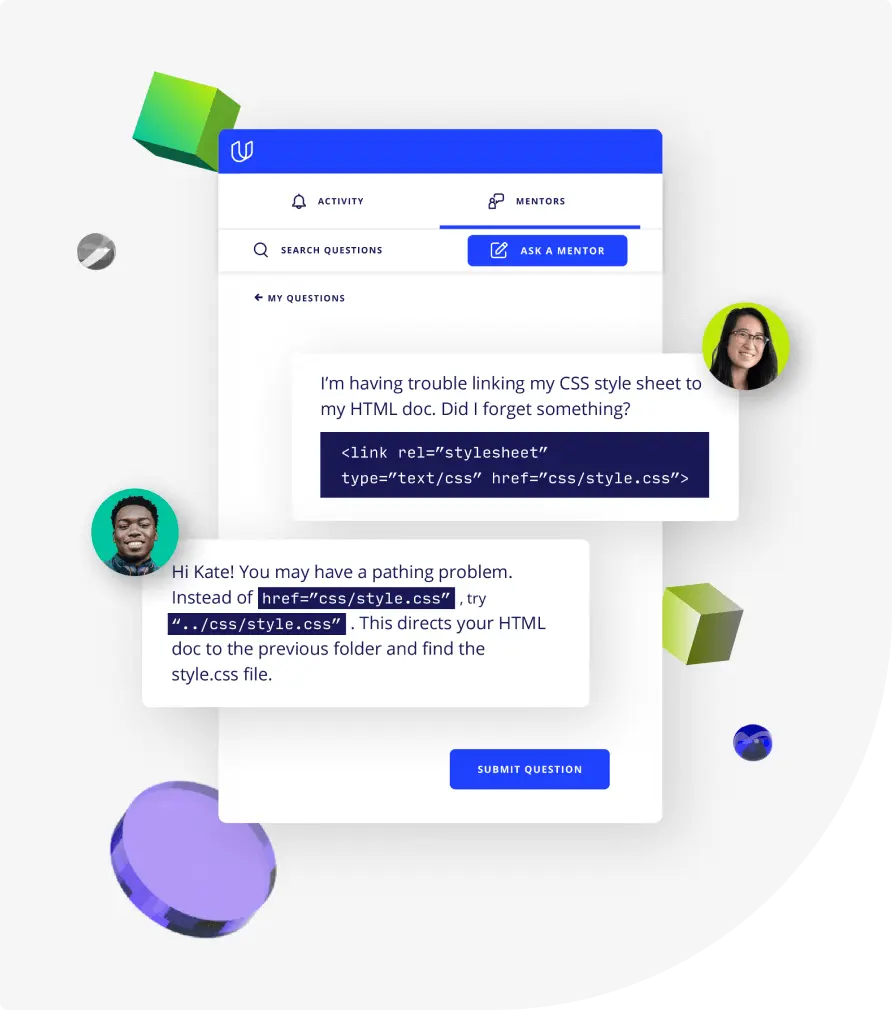
Get help from subject matter experts
Learn industry best practices
Gain valuable insights and improve your skills

Unlimited access to our top-rated courses
Real-world projects
Personalized project reviews
Program certificates
Proven career outcomes
Full Catalog Access
One subscription opens up this course and our entire catalog of projects and skills.
Average time to complete a Nanodegree program

Data Visualization