
Lesson 1
Getting Up and Running
Sam Dutton, developer advocate at Google, explains the importance of getting responsive images right and helps you setup mobile developer tools.
Course
Go beyond image tags! Learn how to make images a part of your responsive design workflow.
Go beyond image tags! Learn how to make images a part of your responsive design workflow.
Last Updated March 7, 2022
No experience required
Lesson 1
Sam Dutton, developer advocate at Google, explains the importance of getting responsive images right and helps you setup mobile developer tools.
Lesson 2
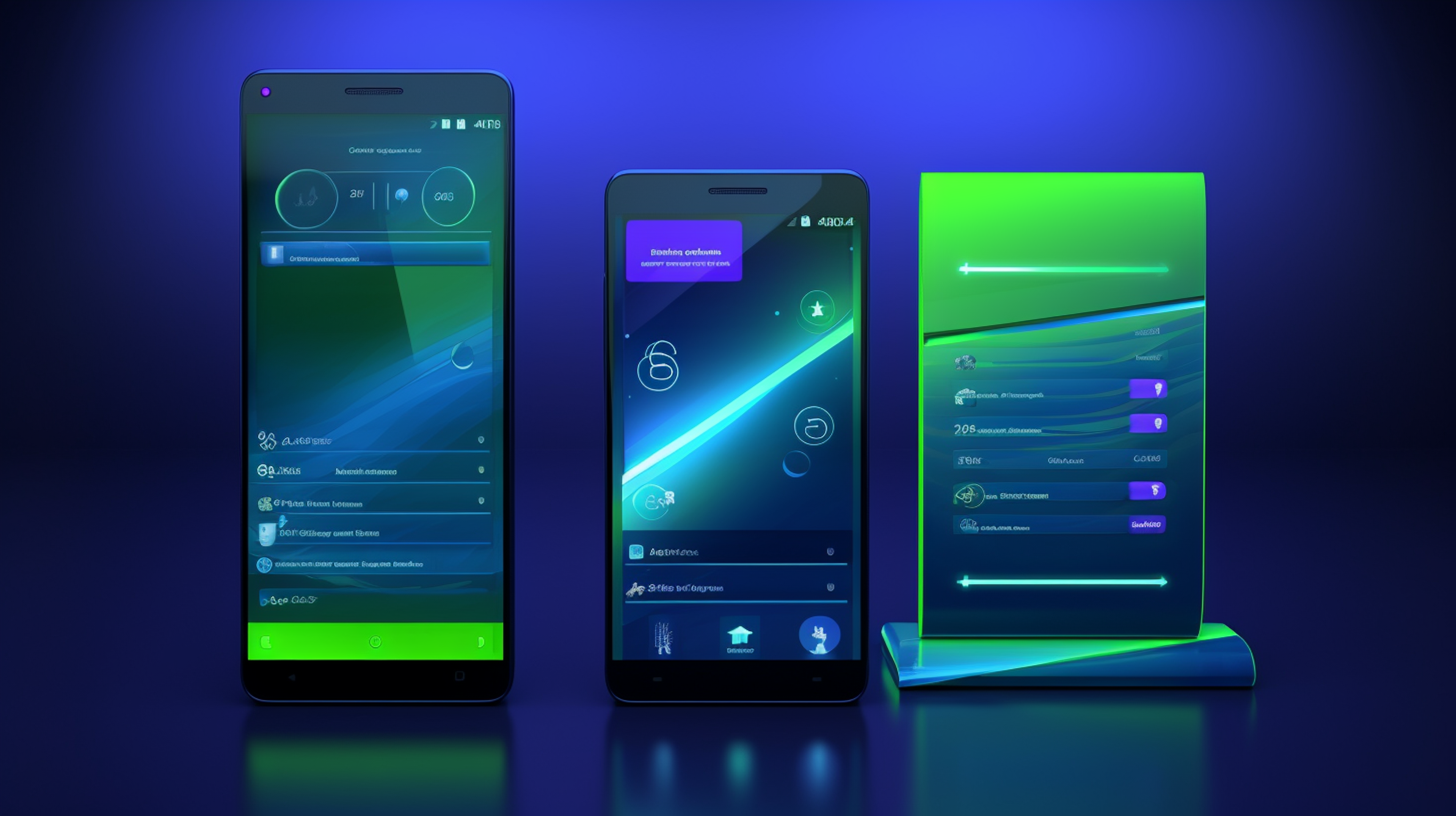
Optimize images to display beautifully on all screen sizes. Learn about the difference between Raster vs Vector images, responsive CSS units, and setting up optimization tools.
Lesson 3
Dive deep into image alternatives like CSS and icon fonts and learn common strategies to alleviate latency.
Lesson 4
Learn to use the srcset attribute and the picture element to choose images of the right size for your application for every viewing context.

Software Engineer at Jacobs

Instructor
Combine technology training for employees with industry experts, mentors, and projects, for critical thinking that pushes innovation. Our proven upskilling system goes after success—relentlessly.
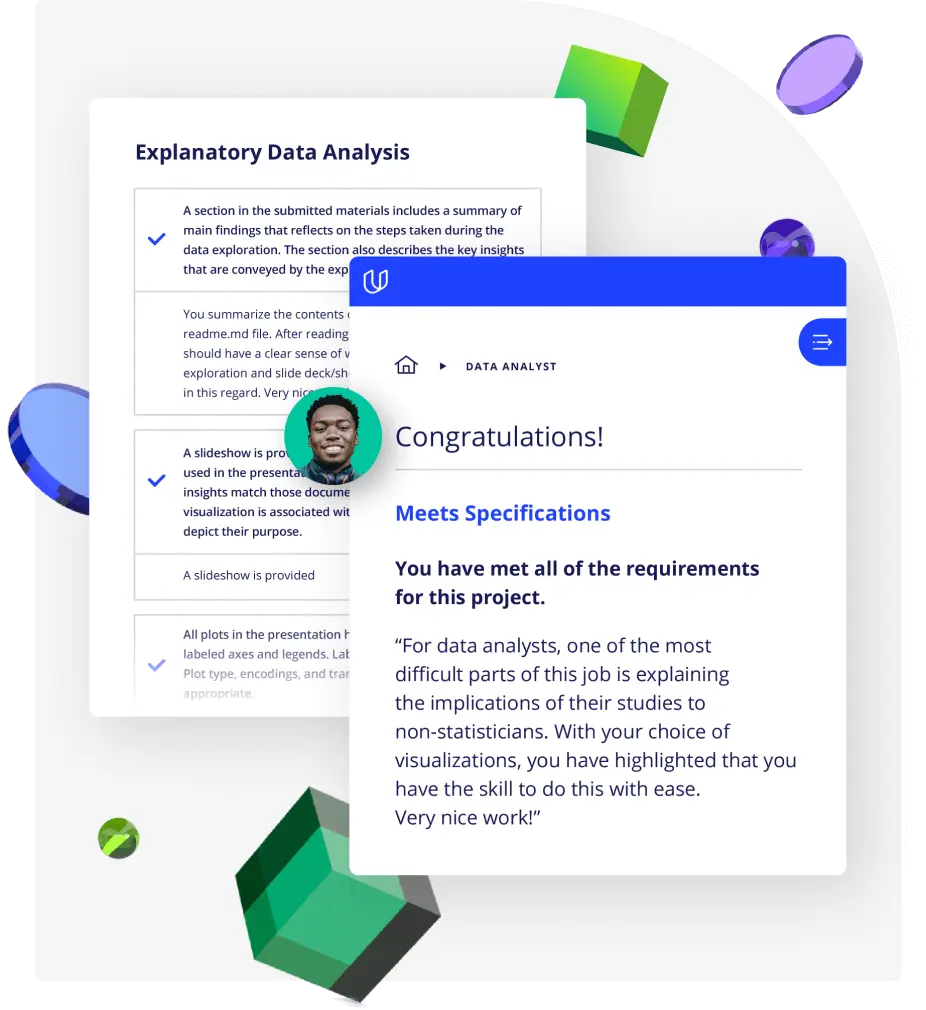
Demonstrate proficiency with practical projects
Projects are based on real-world scenarios and challenges, allowing you to apply the skills you learn to practical situations, while giving you real hands-on experience.
Gain proven experience
Retain knowledge longer
Apply new skills immediately
Top-tier services to ensure learner success
Reviewers provide timely and constructive feedback on your project submissions, highlighting areas of improvement and offering practical tips to enhance your work.
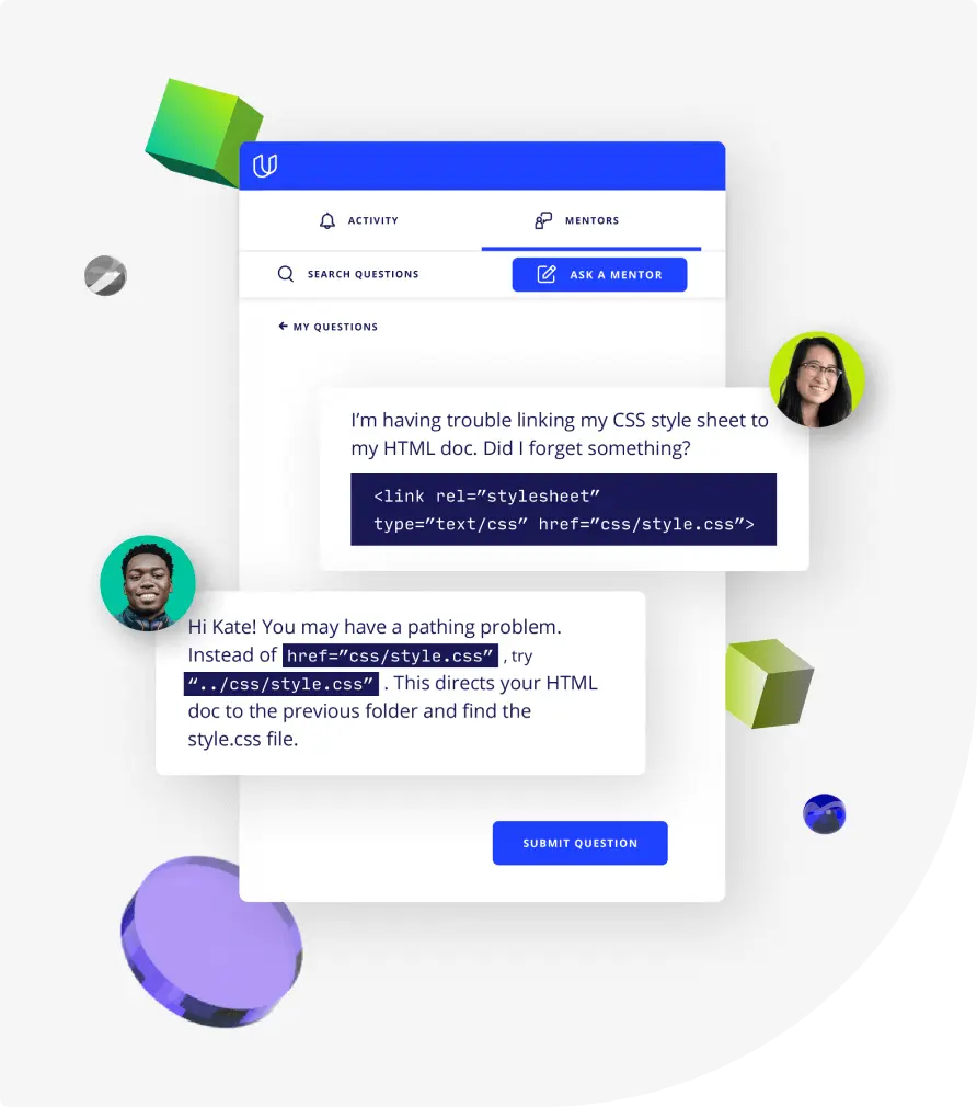
Get help from subject matter experts
Learn industry best practices
Gain valuable insights and improve your skills